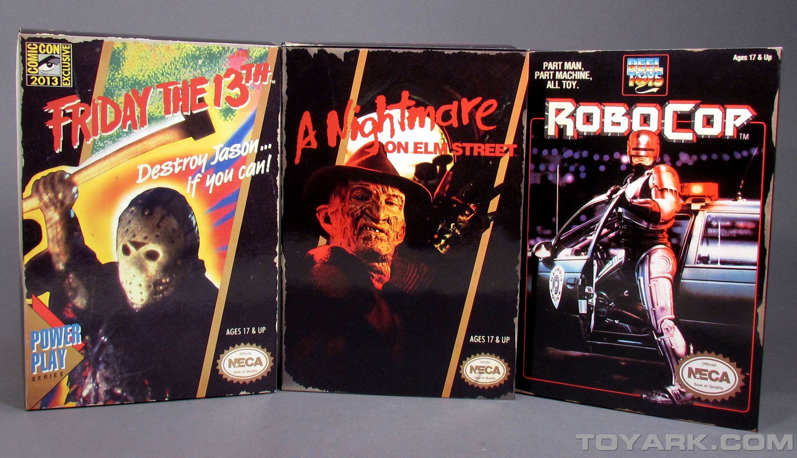
The NECA Video Game Series is proving to have some serious legs. What started off as a niche exclusive is blowing up to become one of NECA‘s best lines. By taking their existing licenses and adding some retro NES flair, they give us incredibly odd and fun versions of characters we already love. Their latest release, NES Robocop, breathes new life into the line by adding an all new paint styling similar to cel chading. This style is carrying over to their NES Predator, and Toy Fair promises to give us even more.
Read on to check out a massive gallery of the figure. I also give my thoughts on the overall figure, the positives and a few problems this paint style has presented.
Review
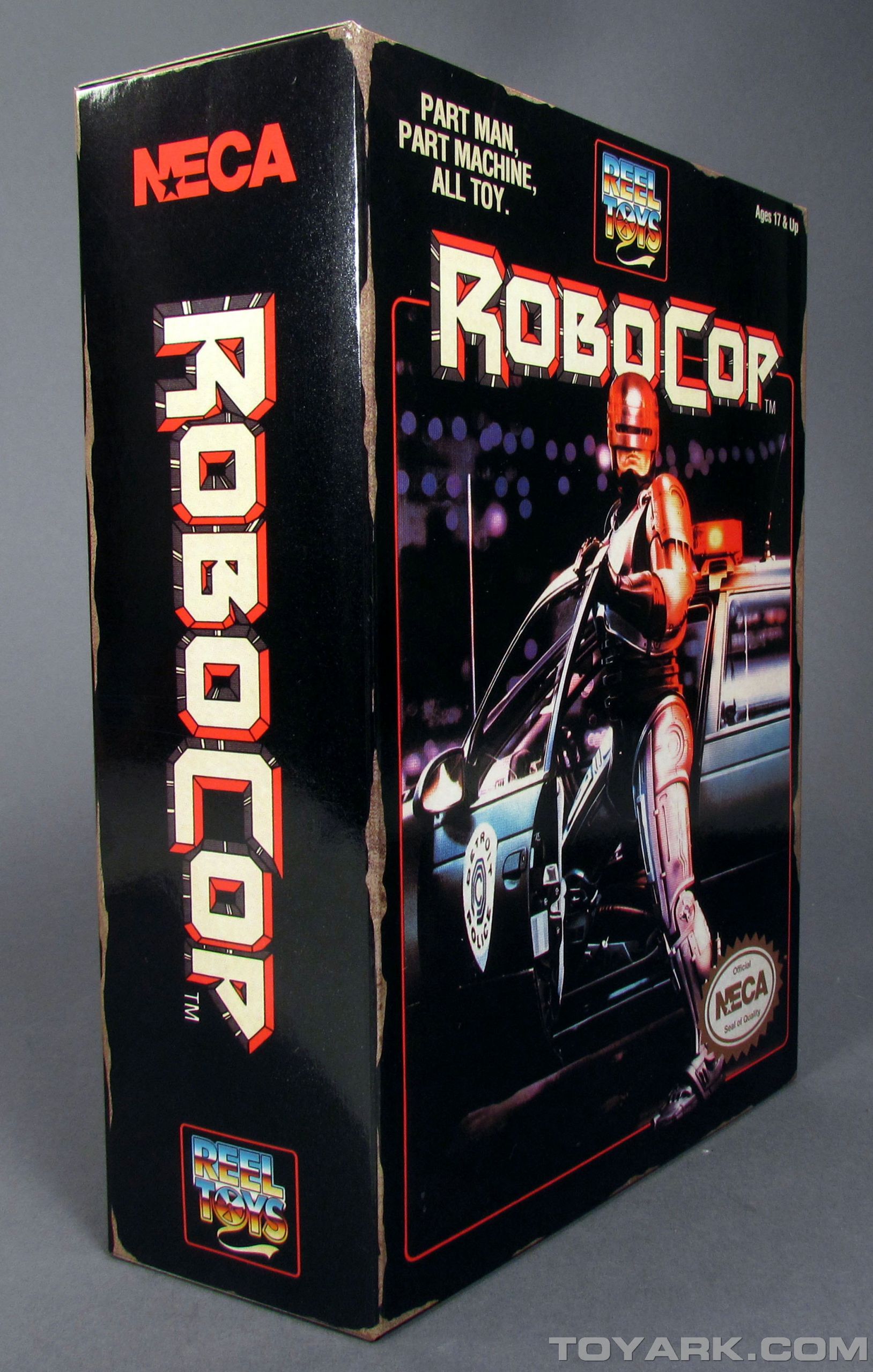
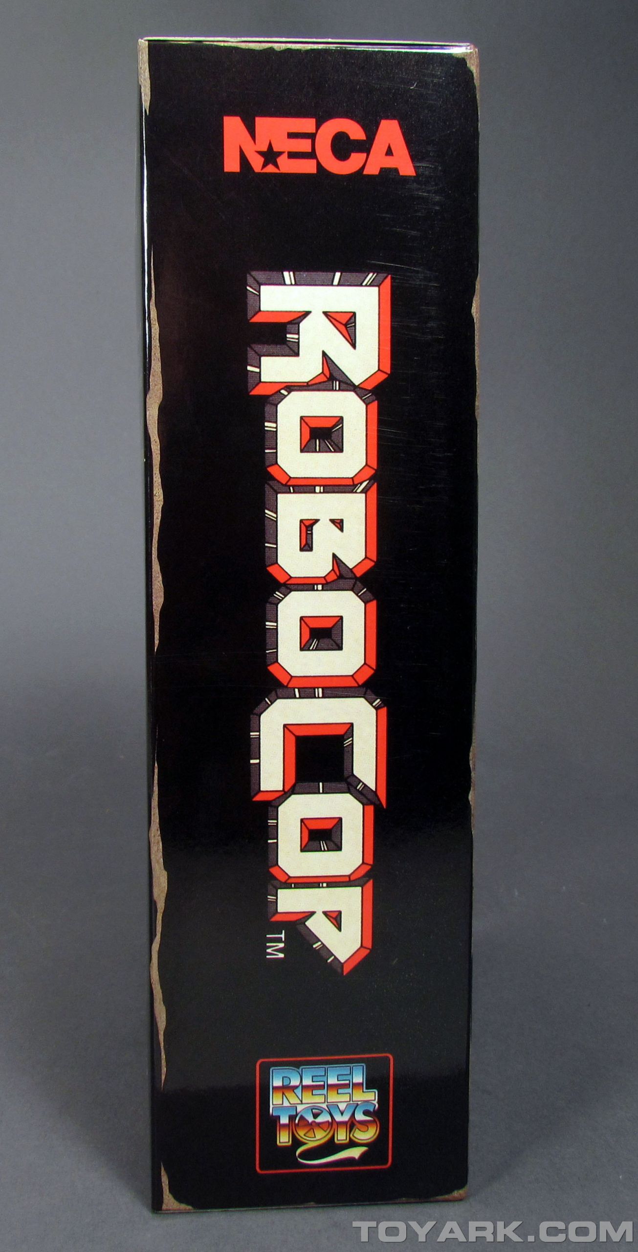
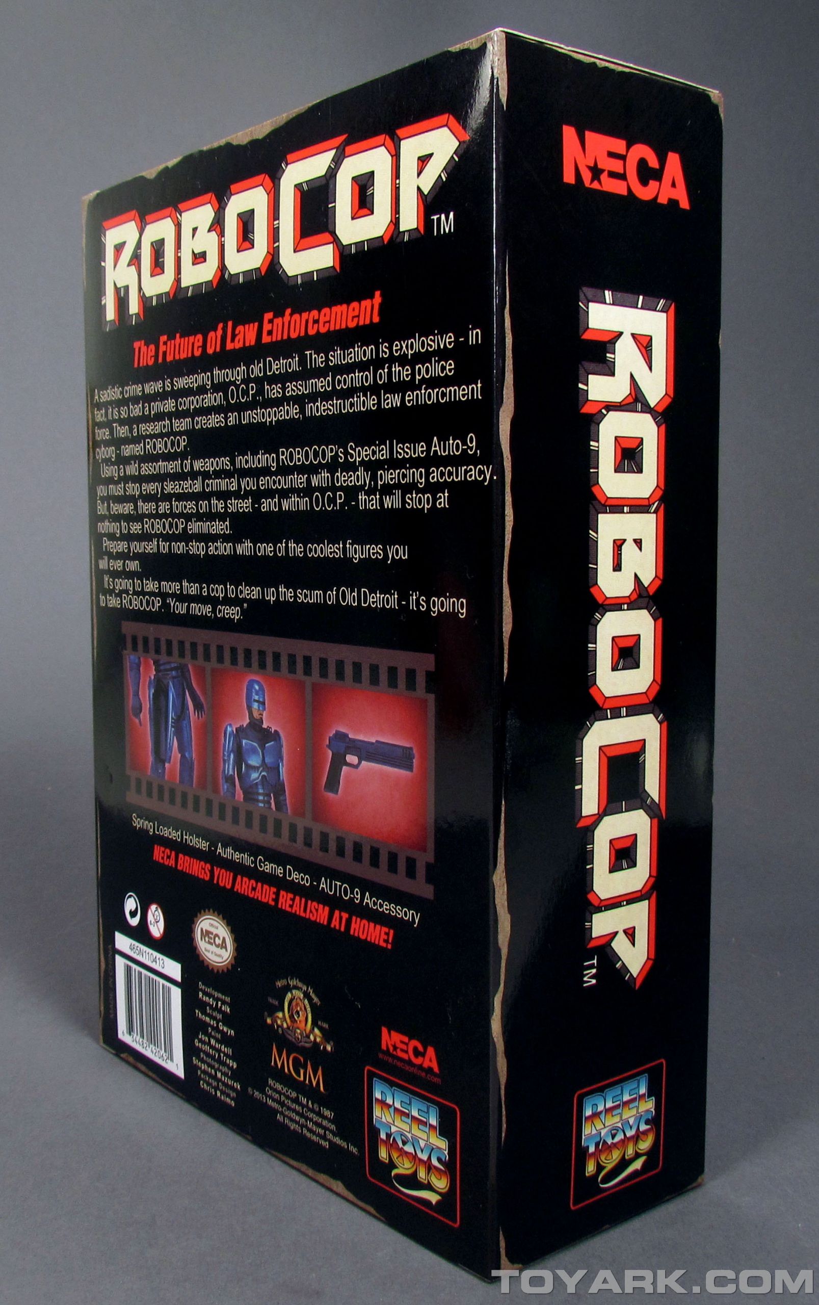
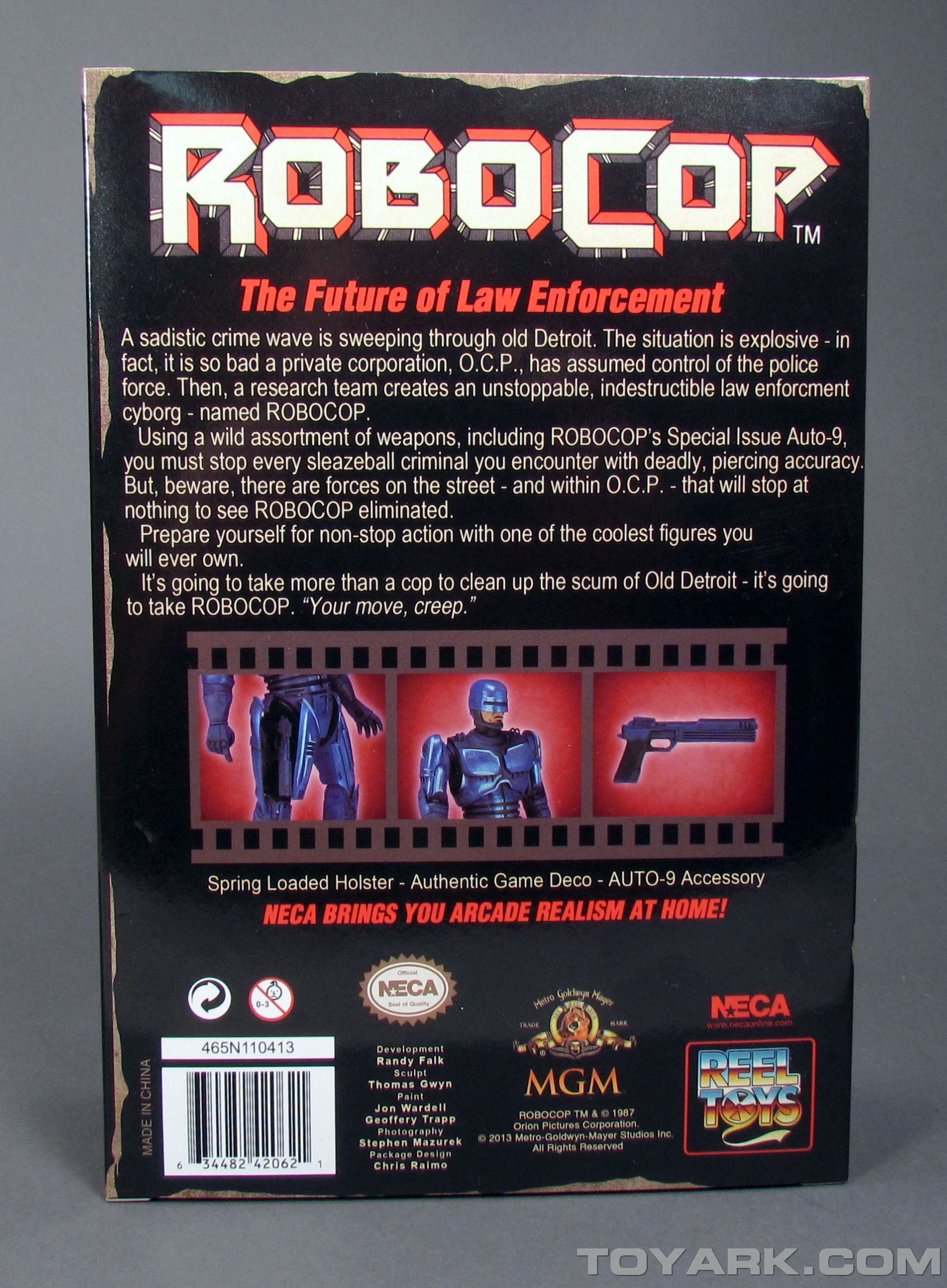
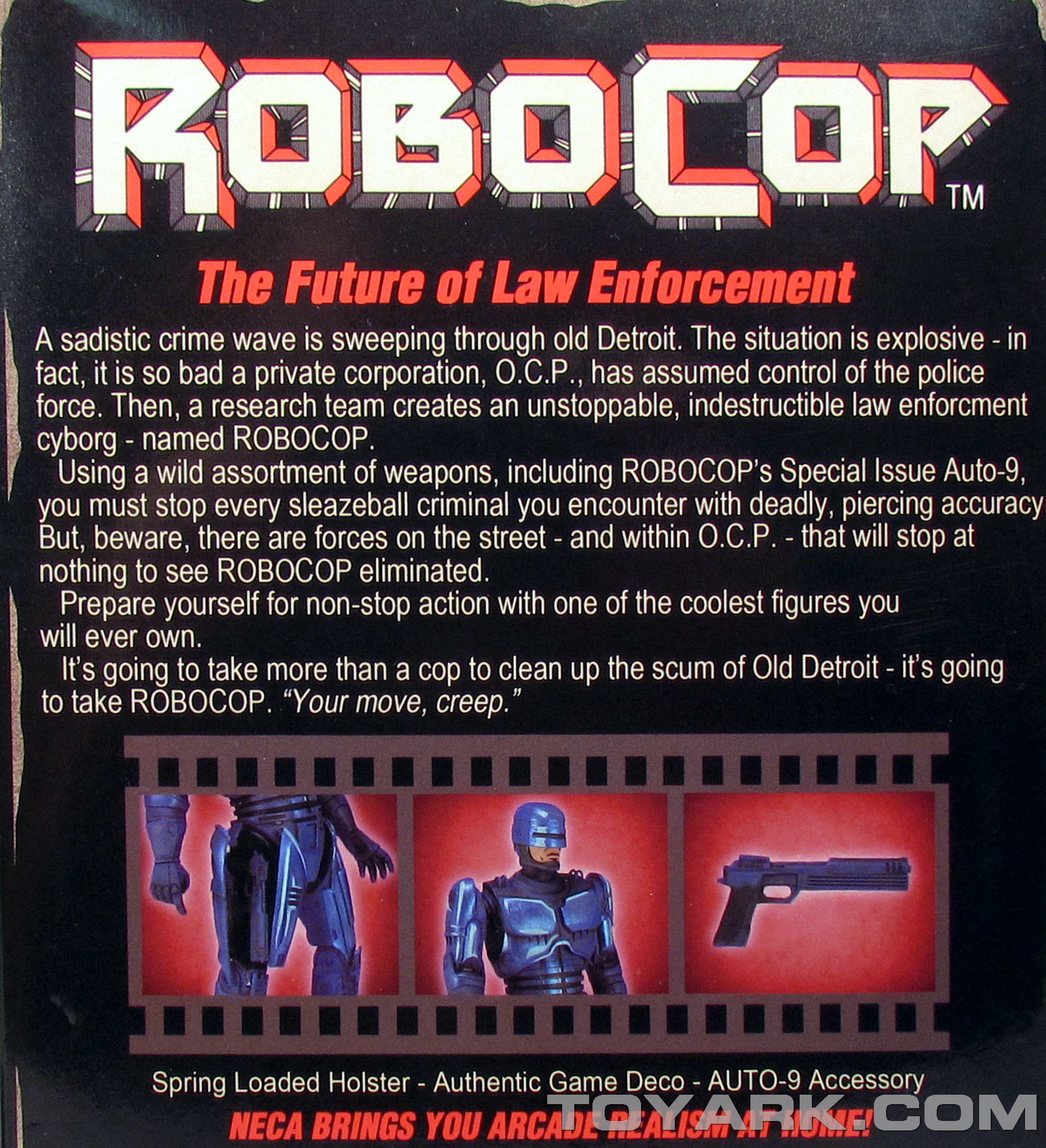
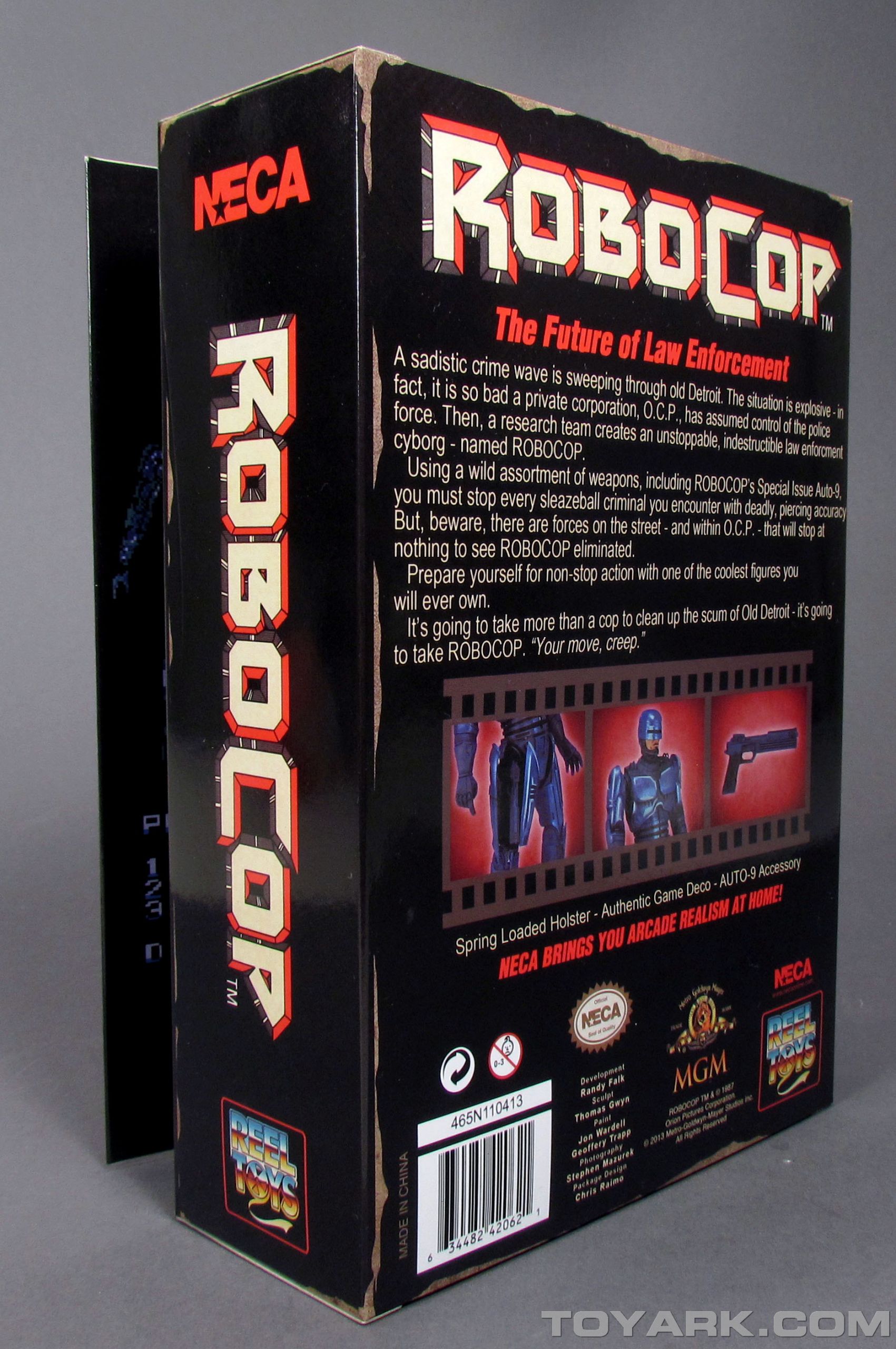
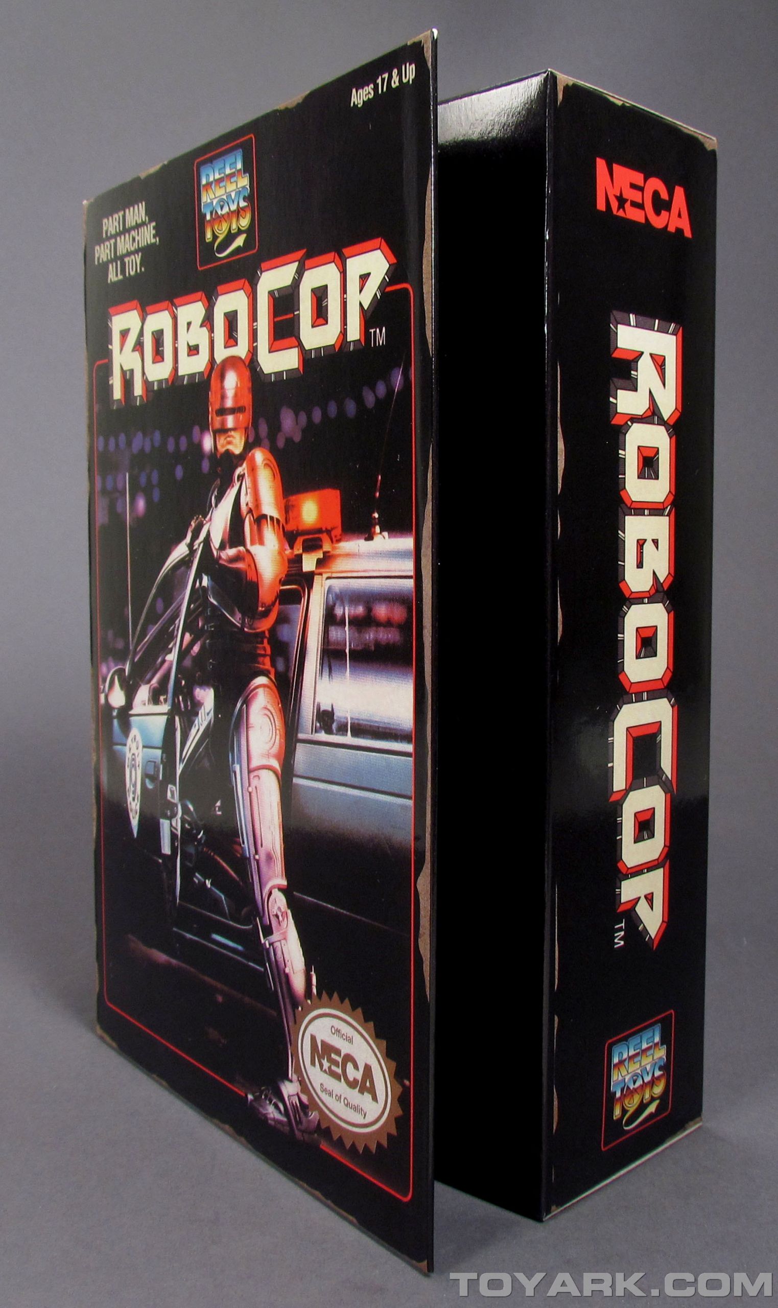
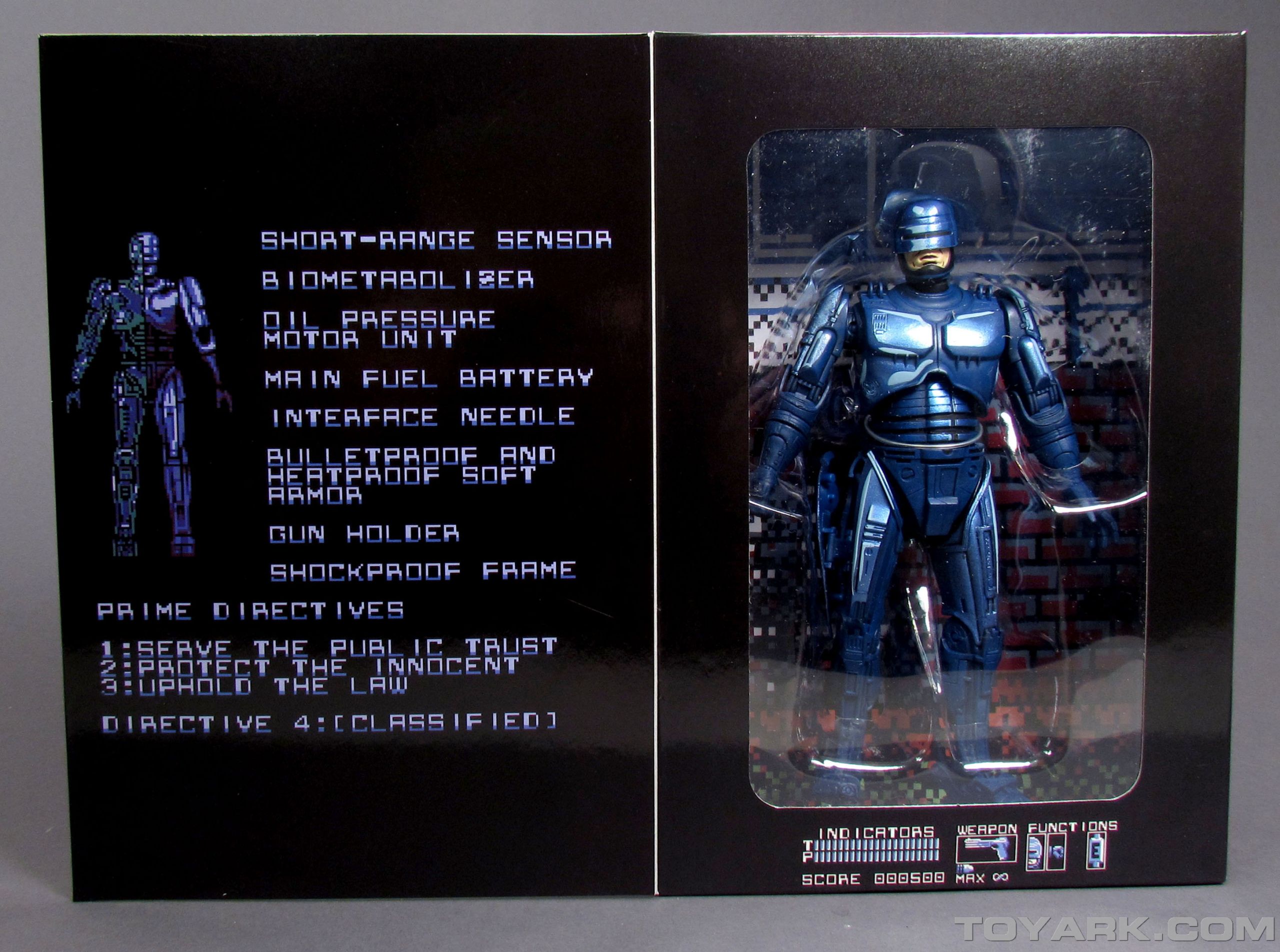
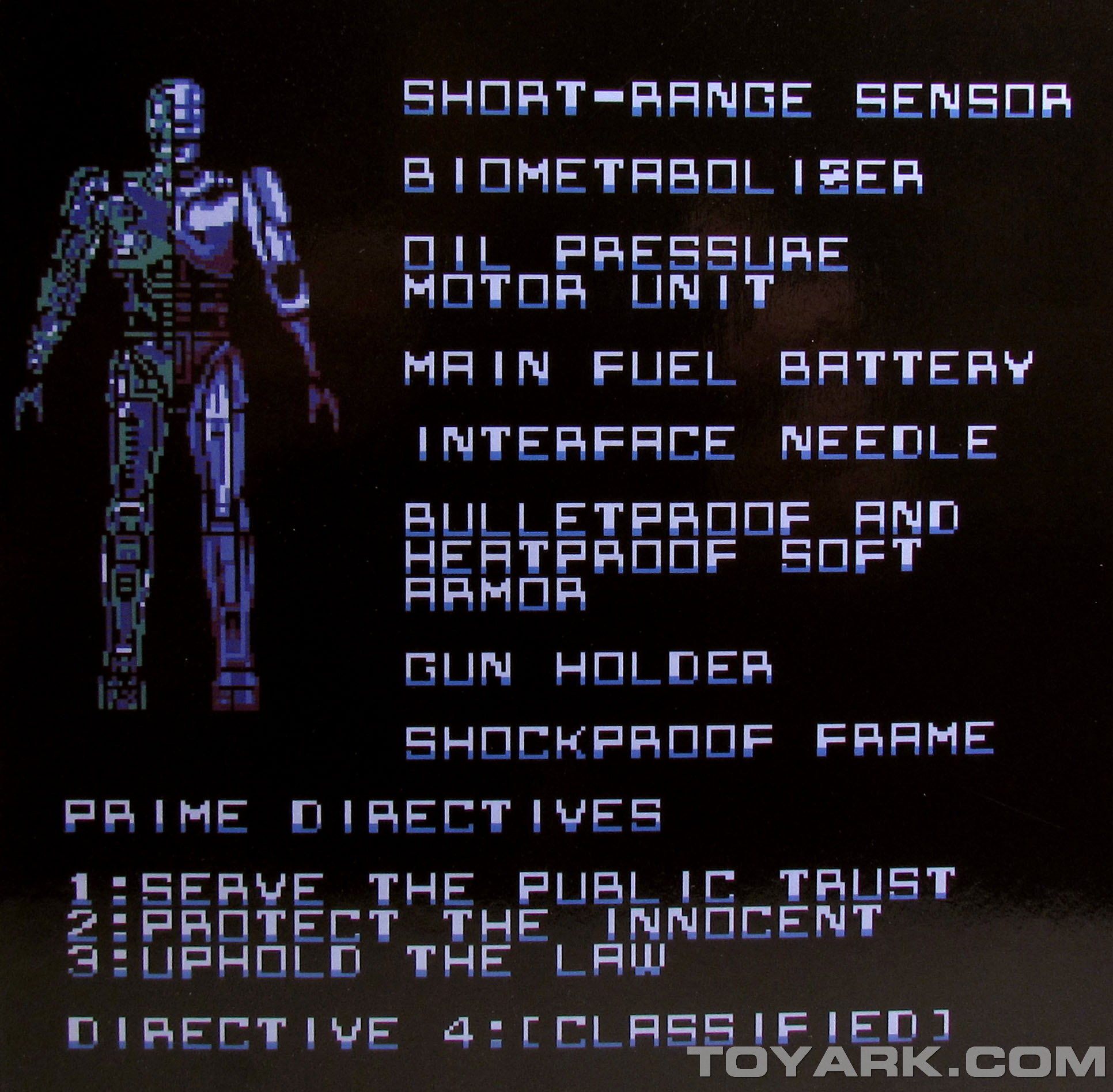
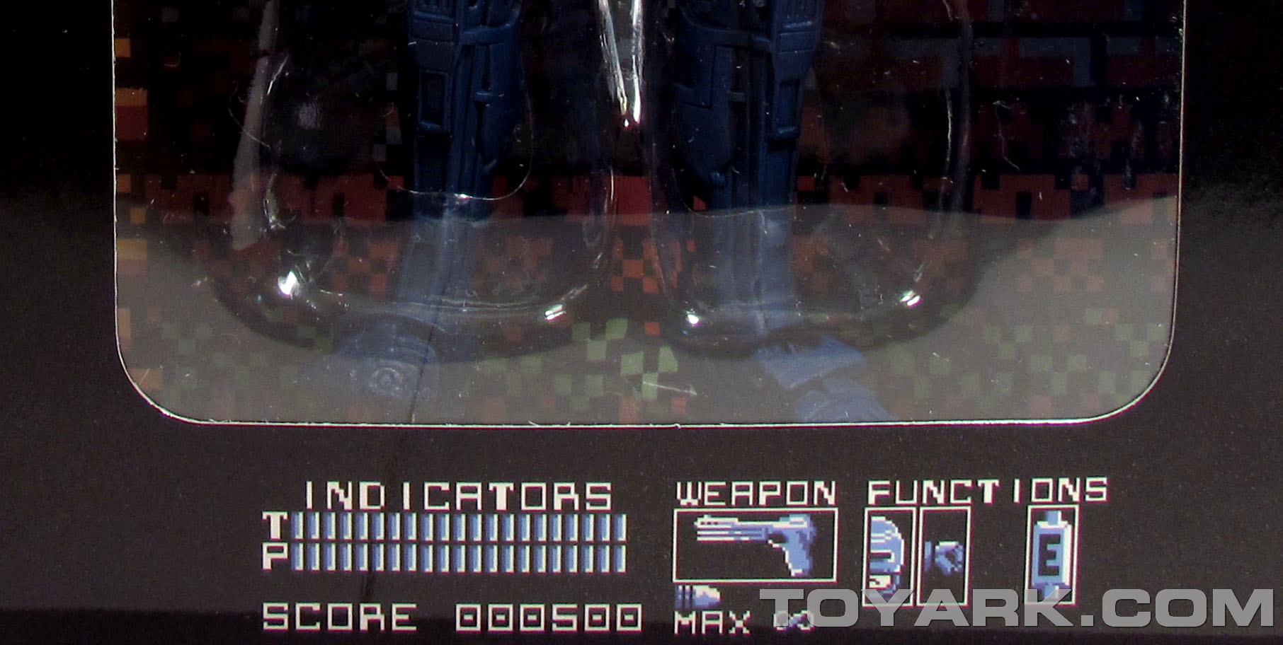
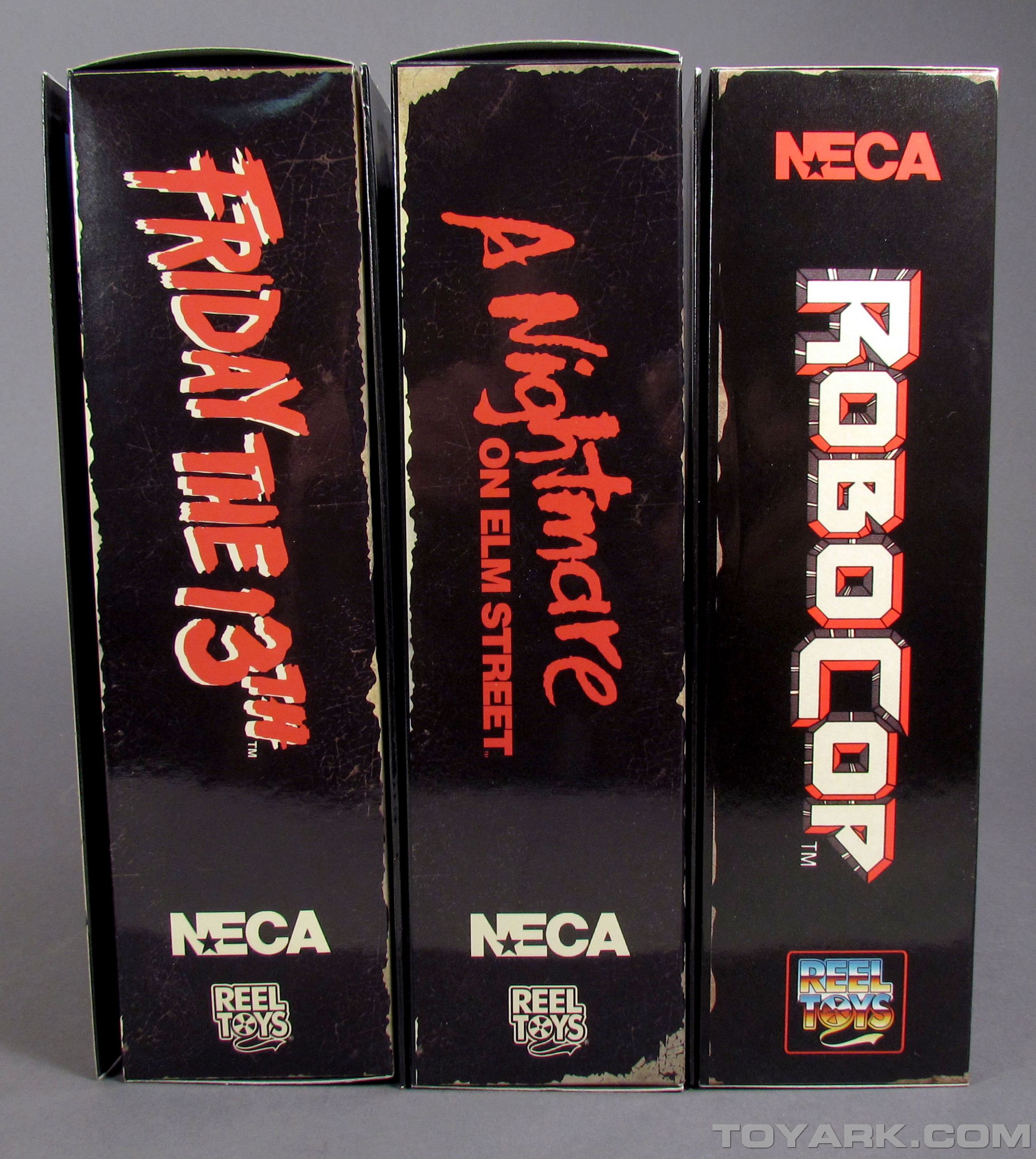
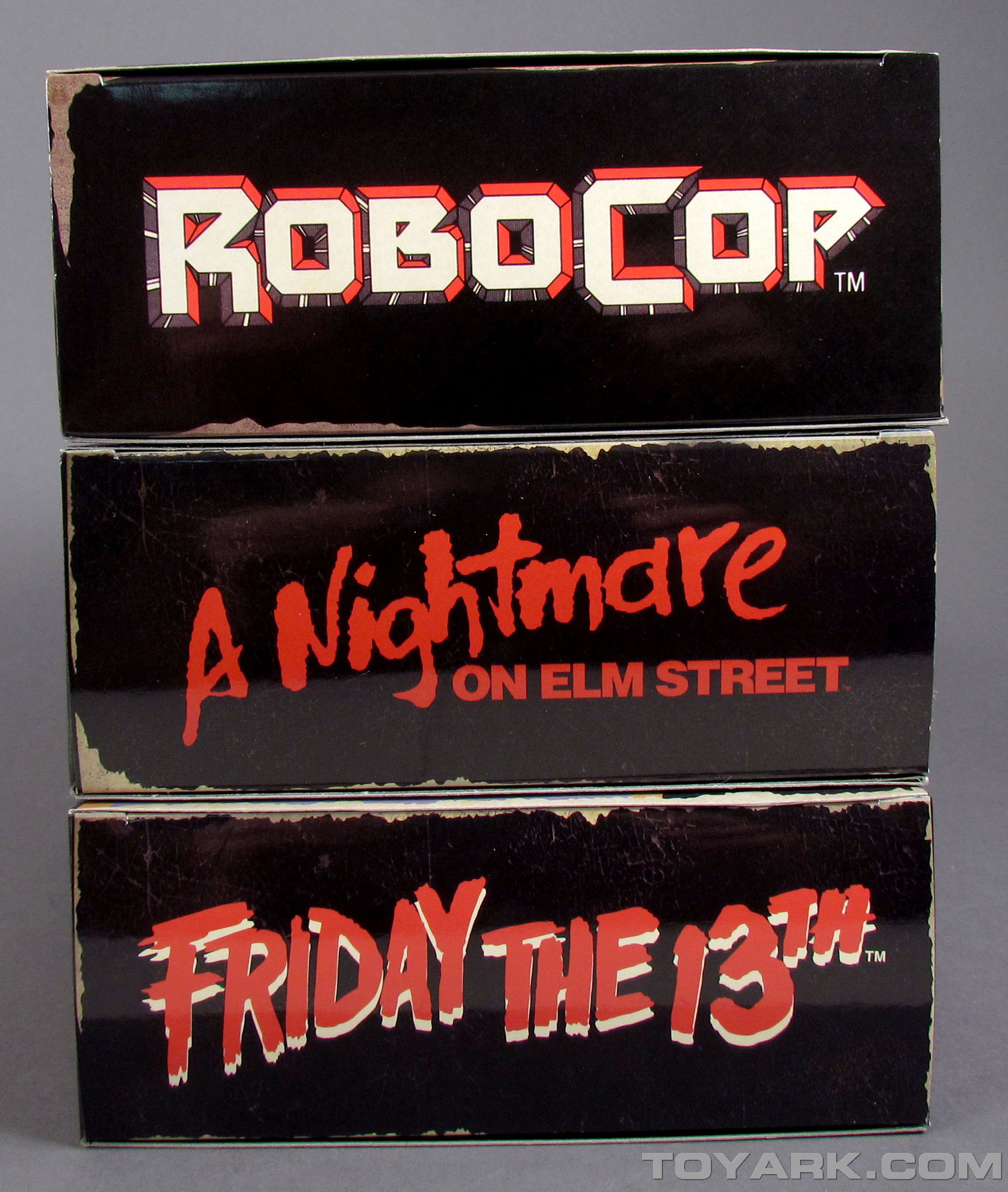
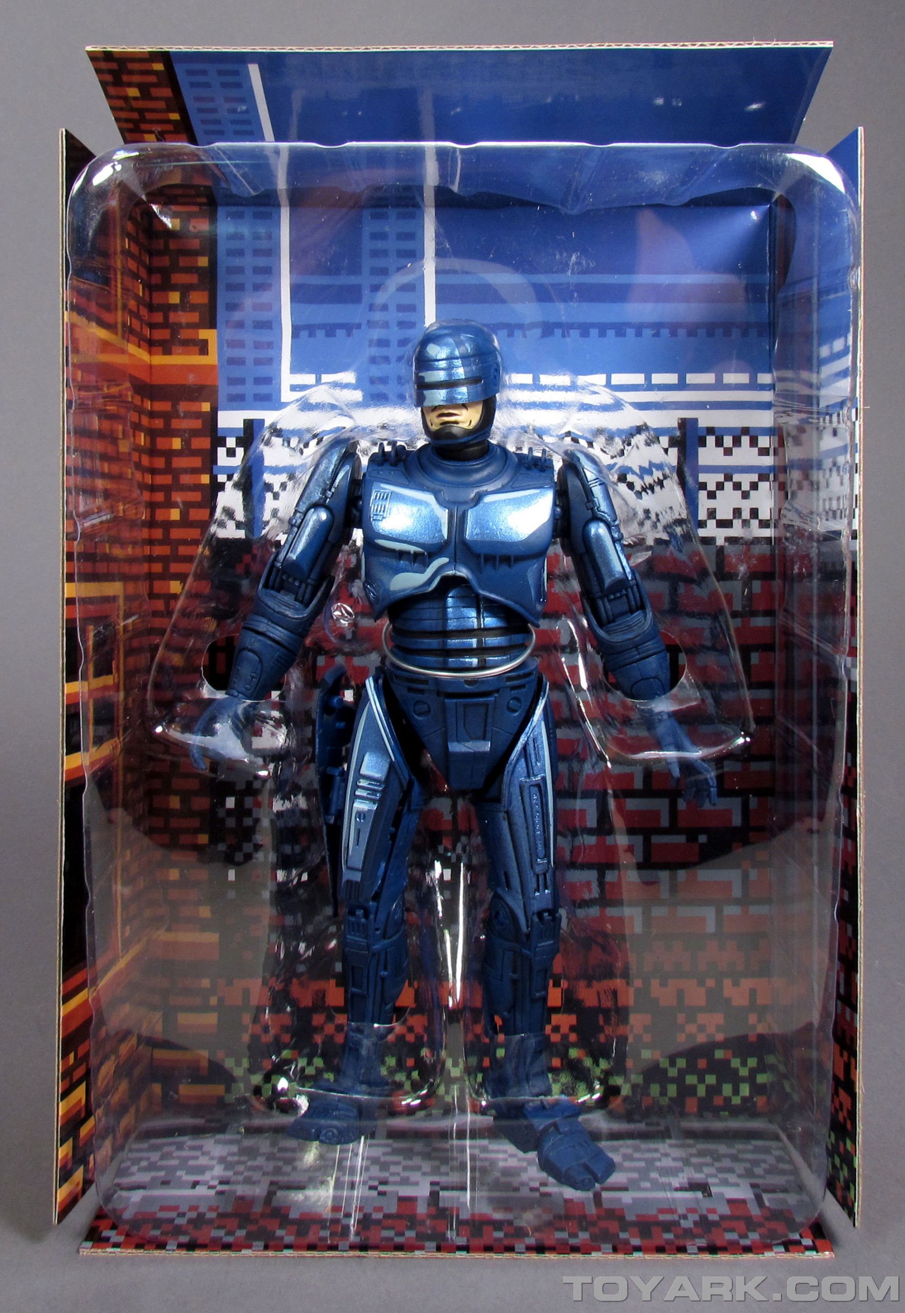
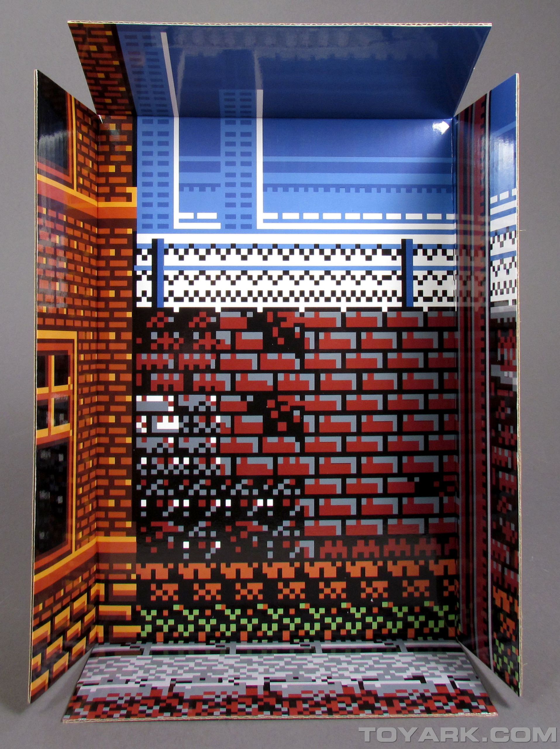
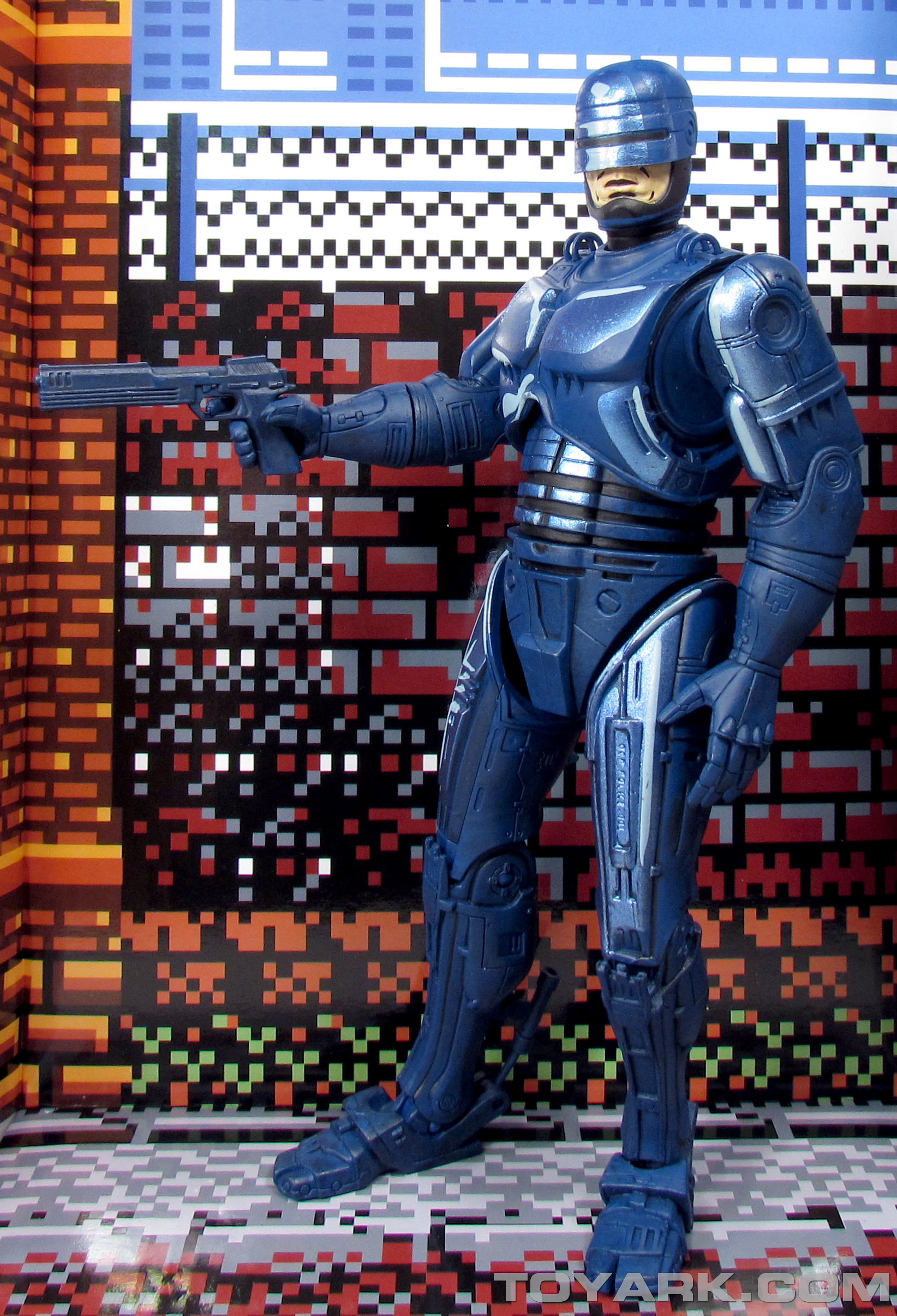
Like the previous releases, the NES Robocop comes packaged in a box that mimics the look of the classic NES packaging. The front is a near identical replication of the original box art, while the back is a mix of the classic styling, with photos of the new figure. The front panel flips open to reveal a window showing the figure. The inside panel has some game graphics and text. There is no tape keeping the figure sealed. The tray insert is clear plastic sitting on top of a cardboard printout of a game background. Robocop is held into the tray by a single twist tie and can be removed easily.
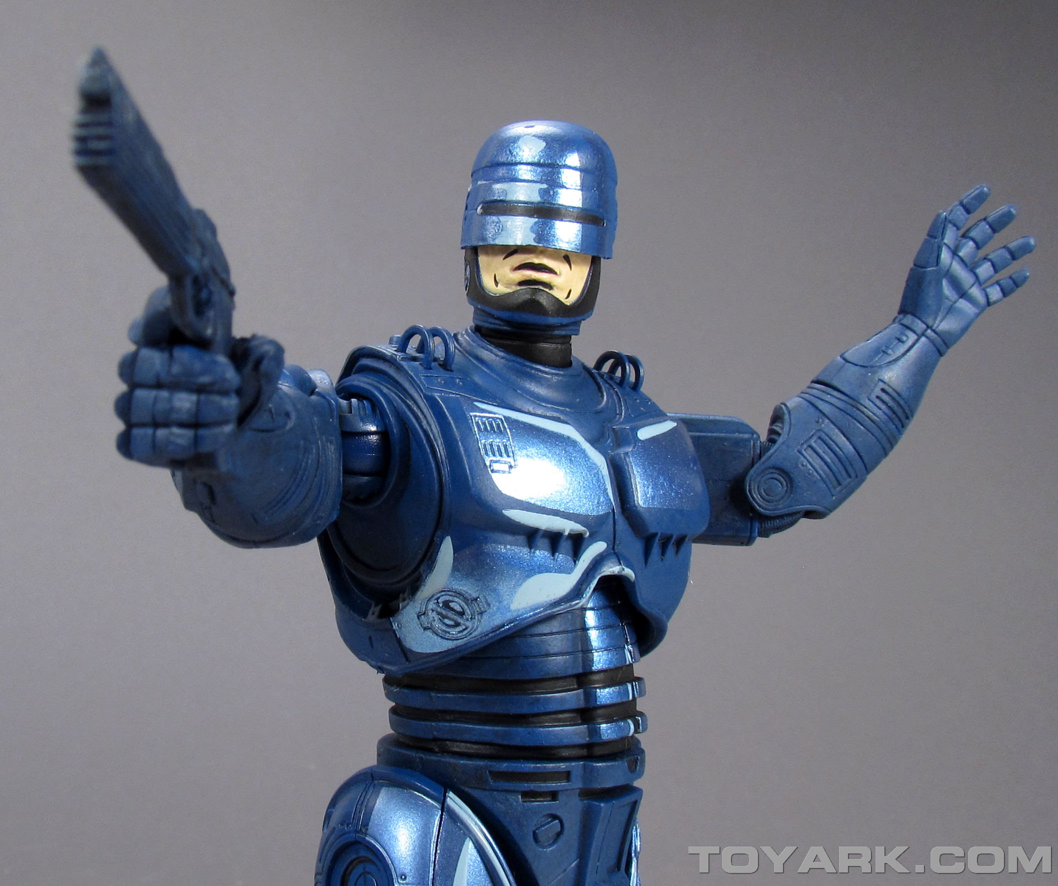
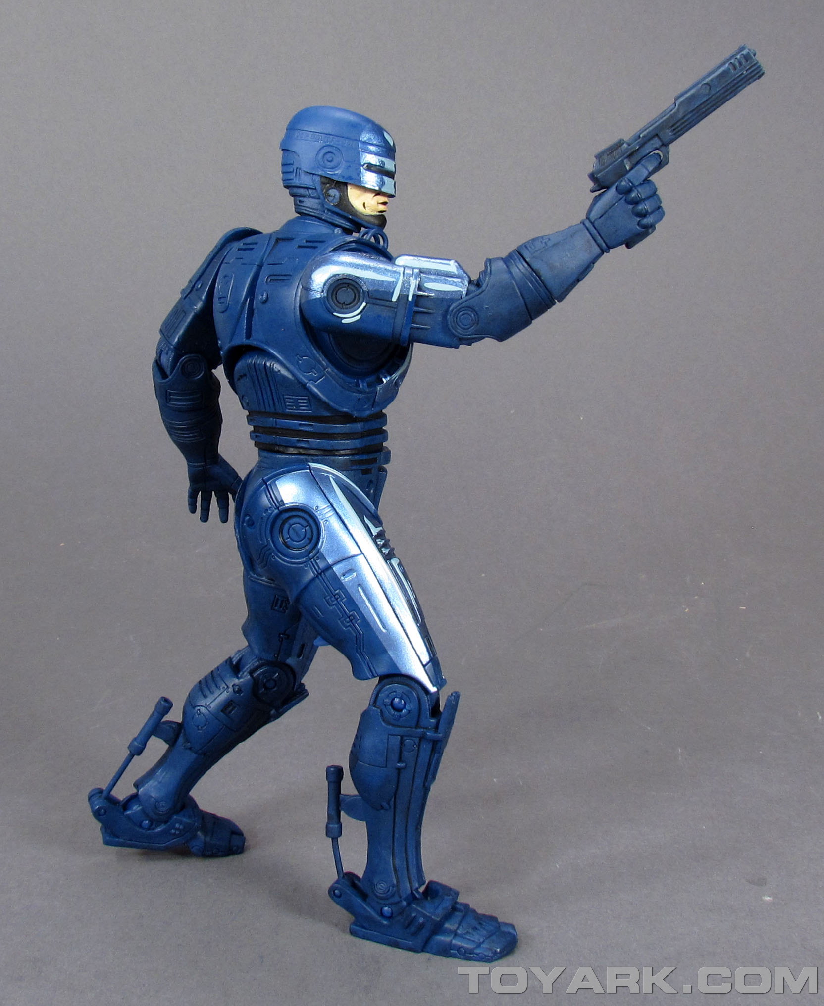
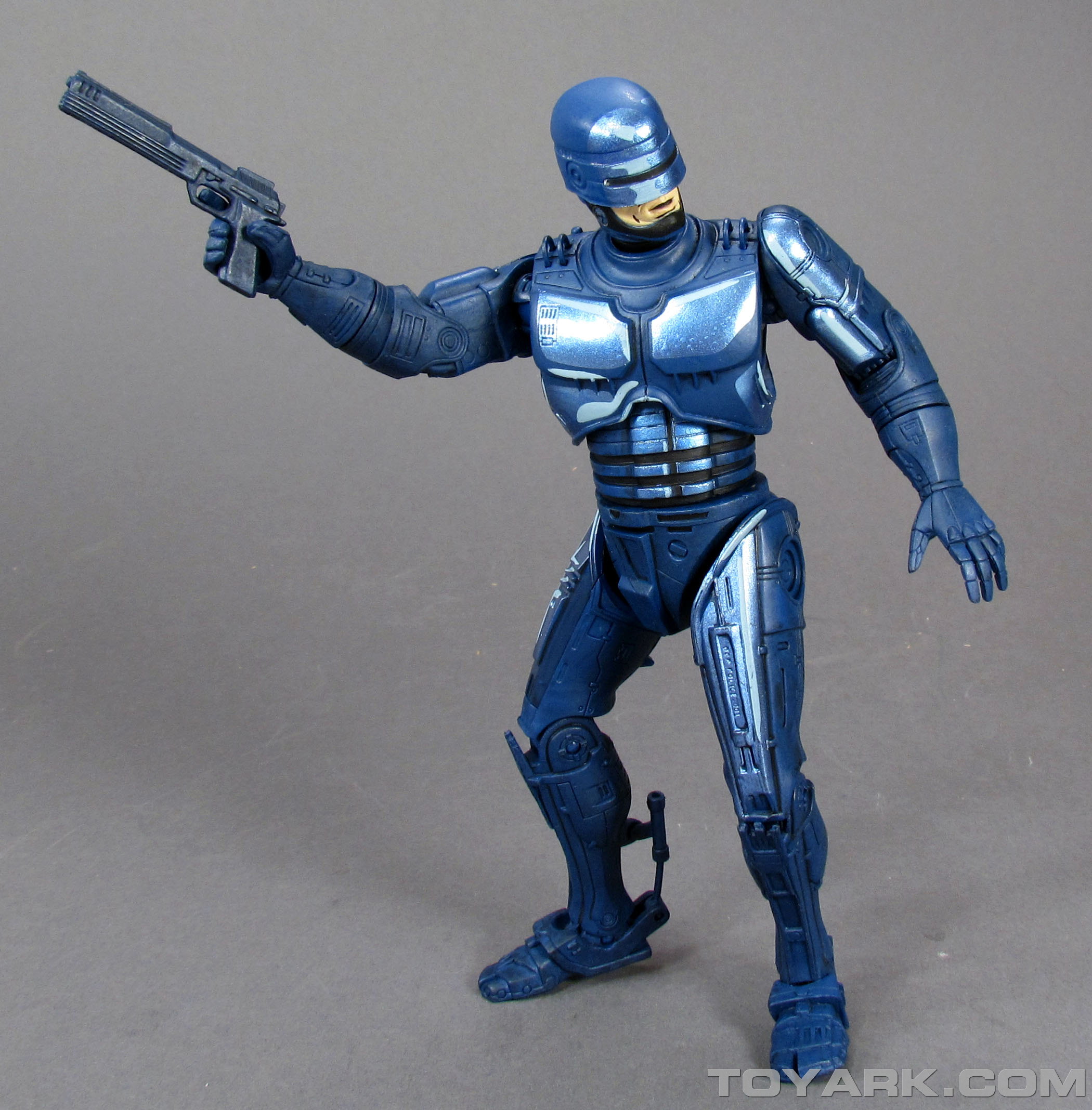
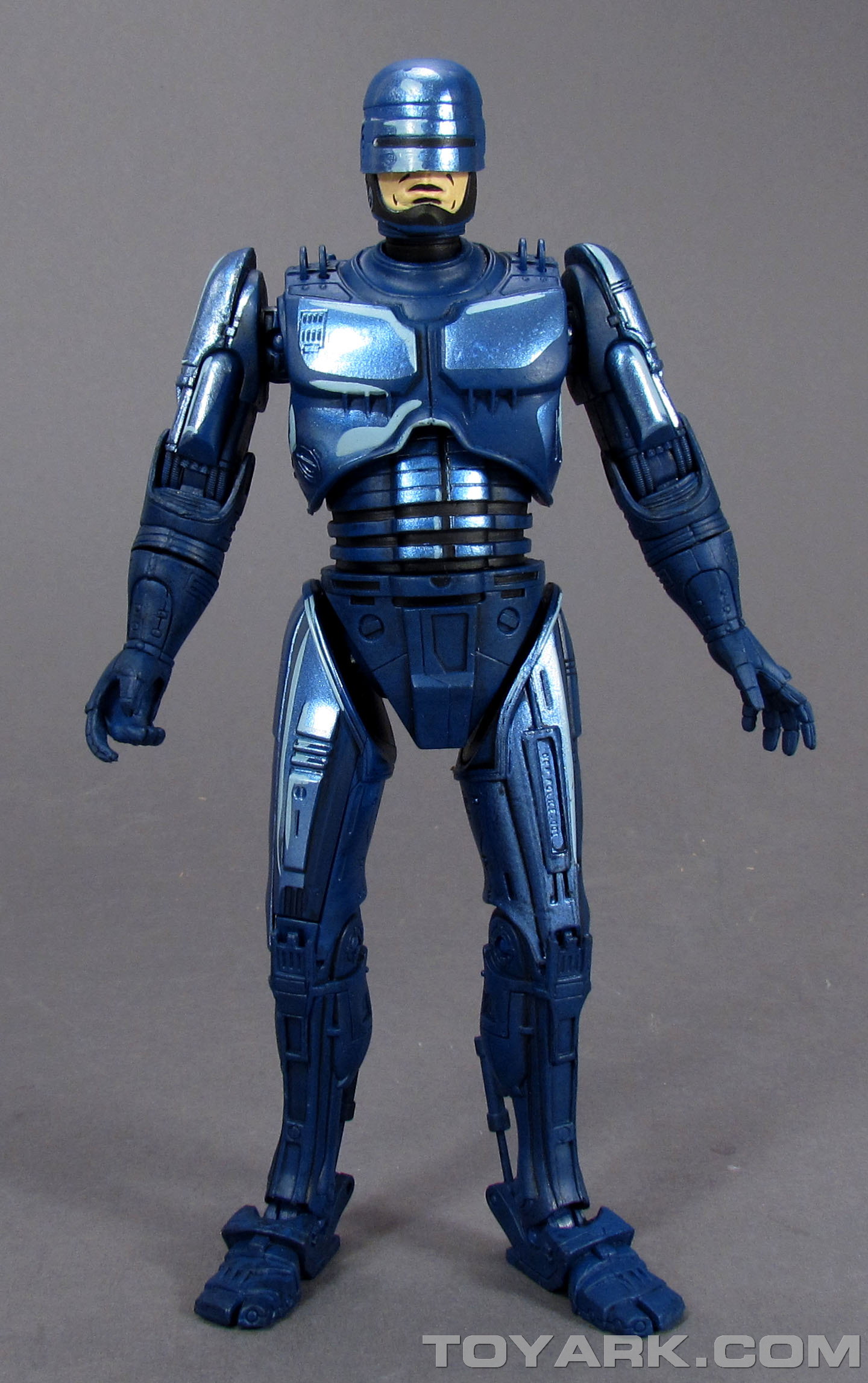
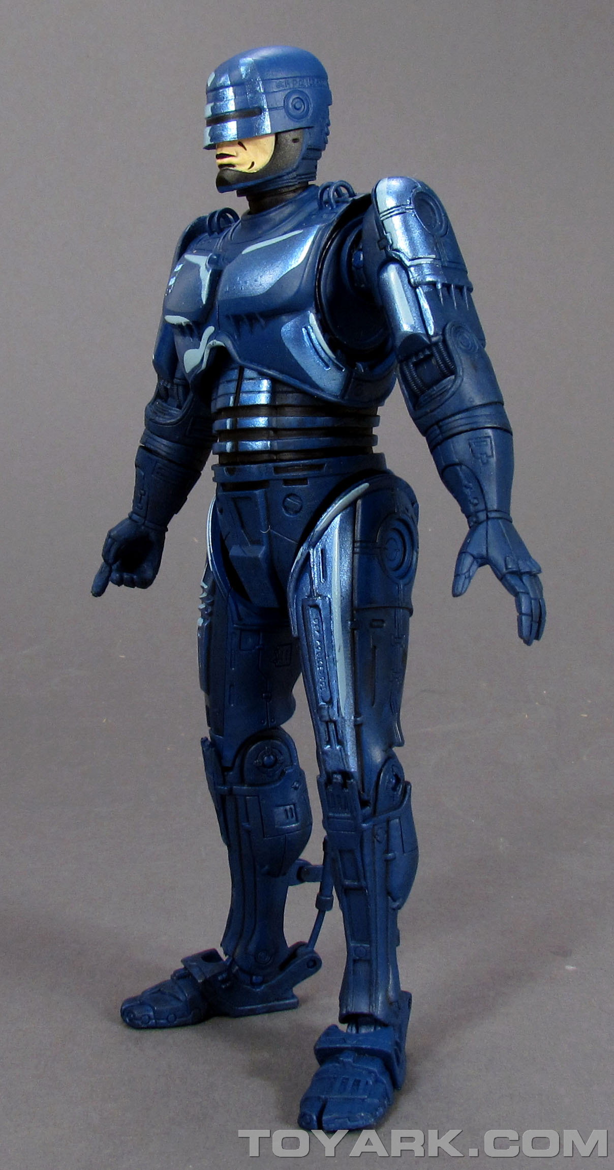
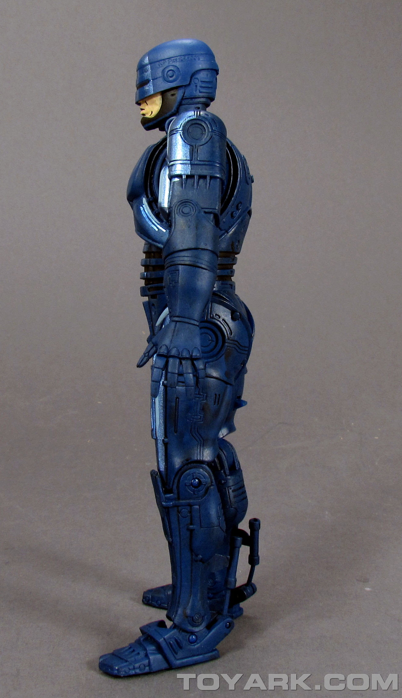
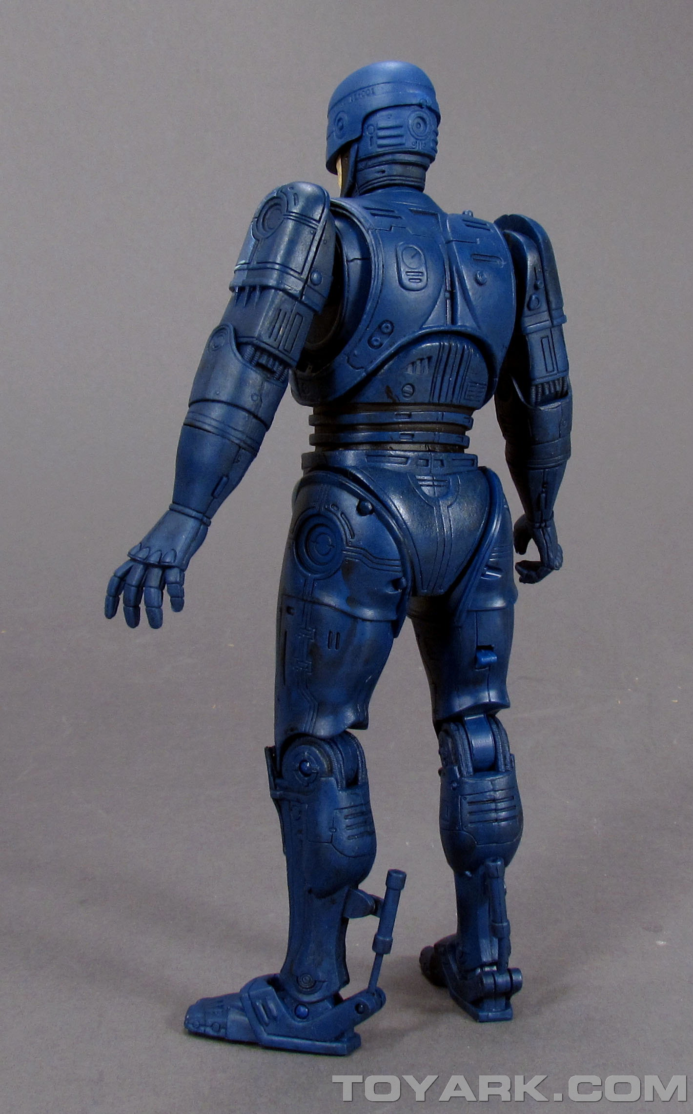
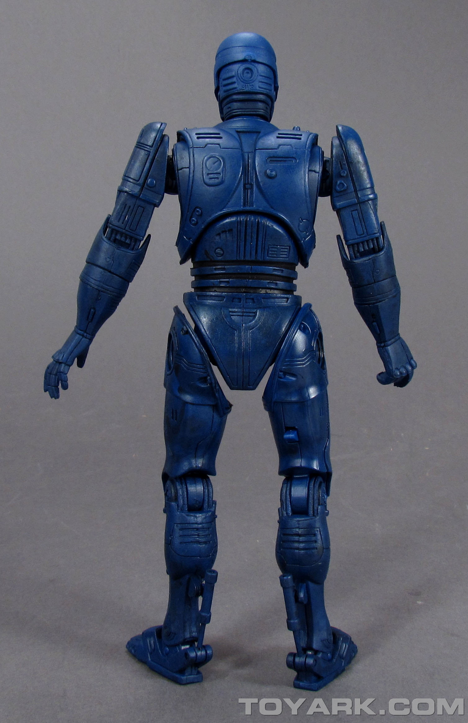
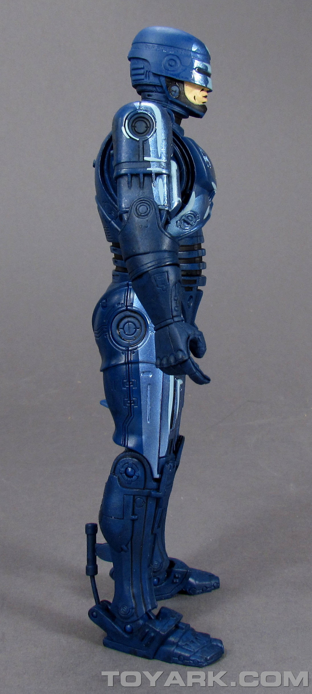
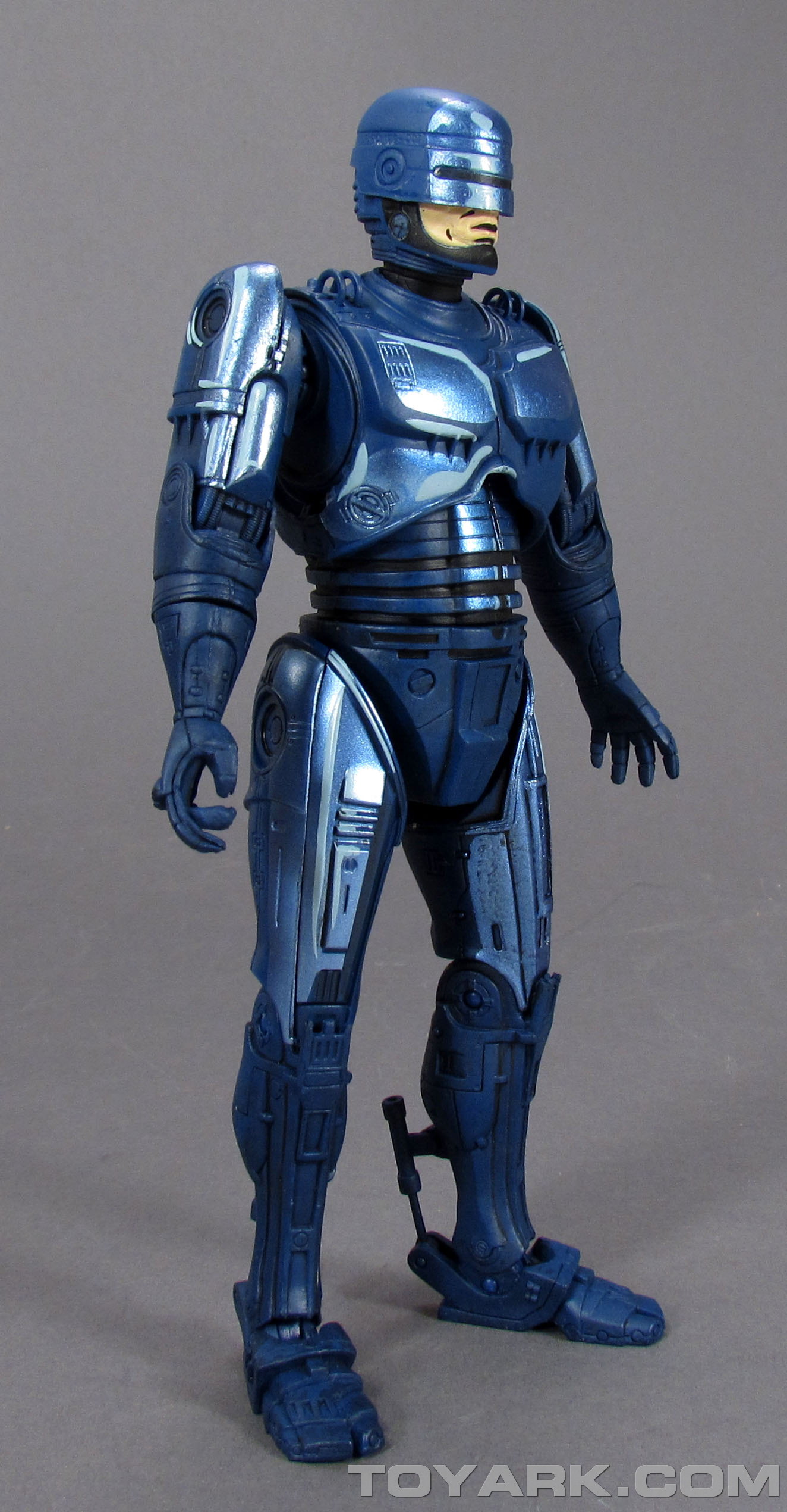
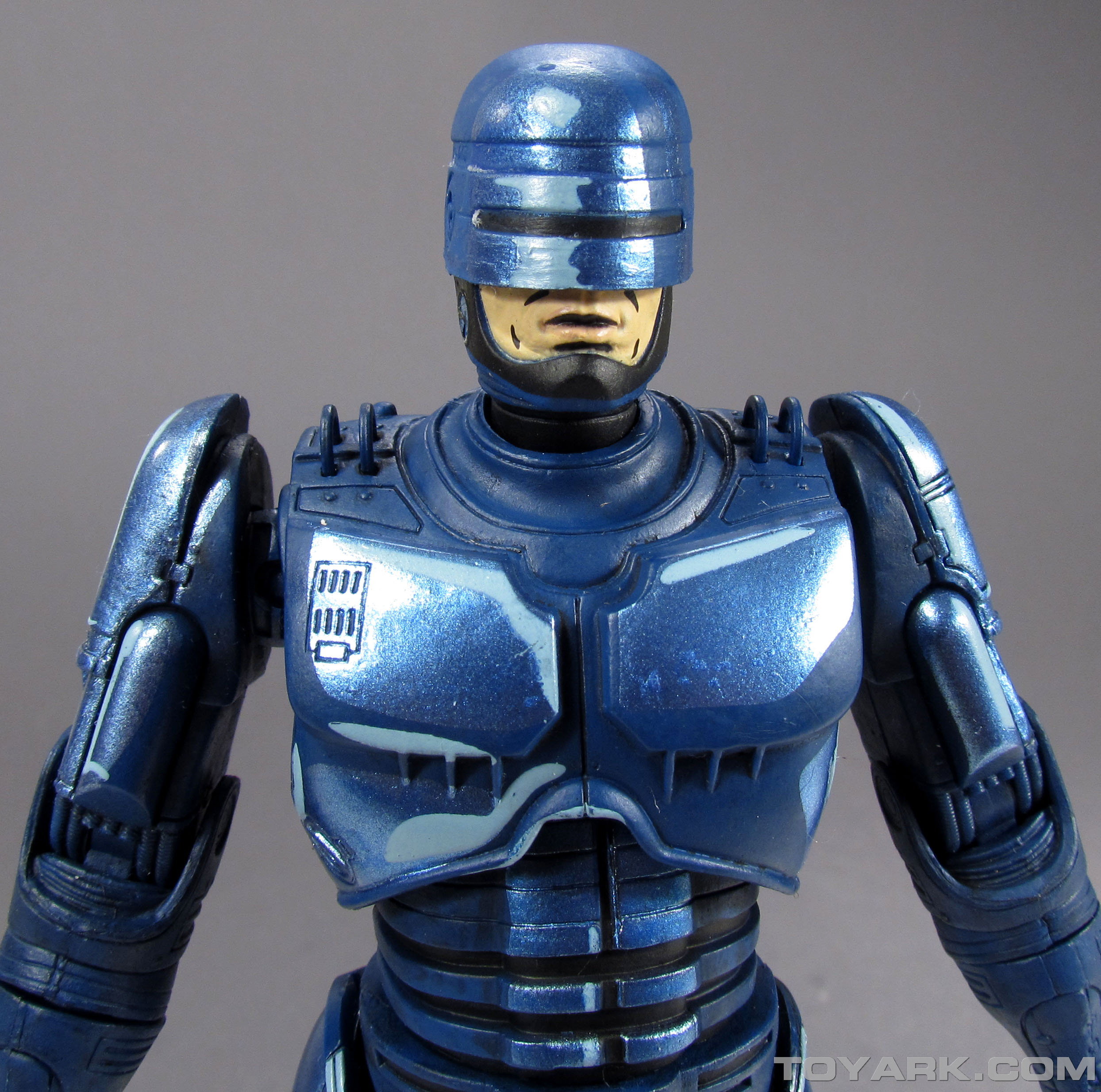
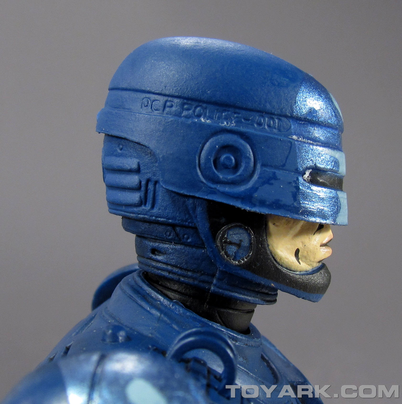
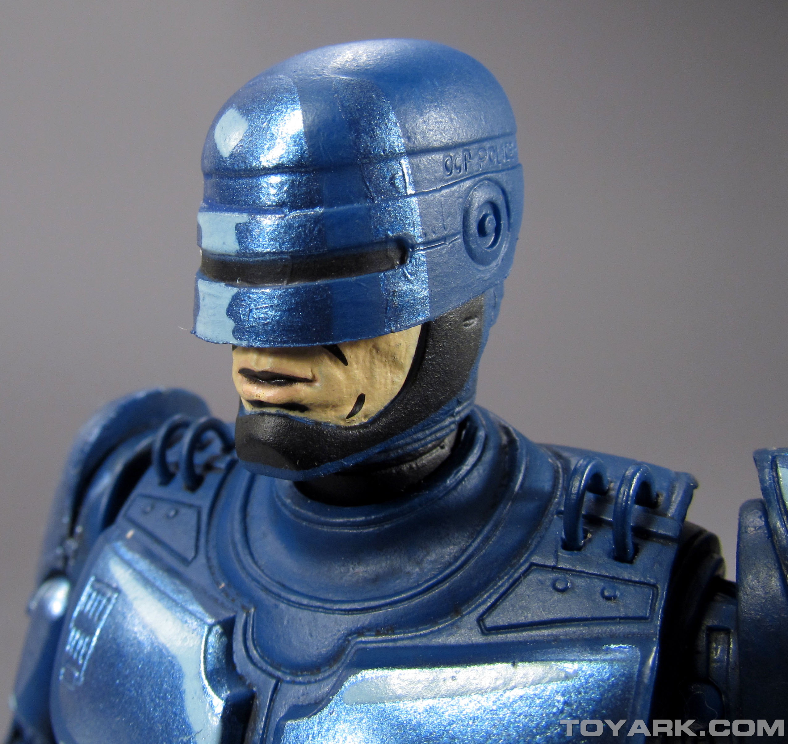
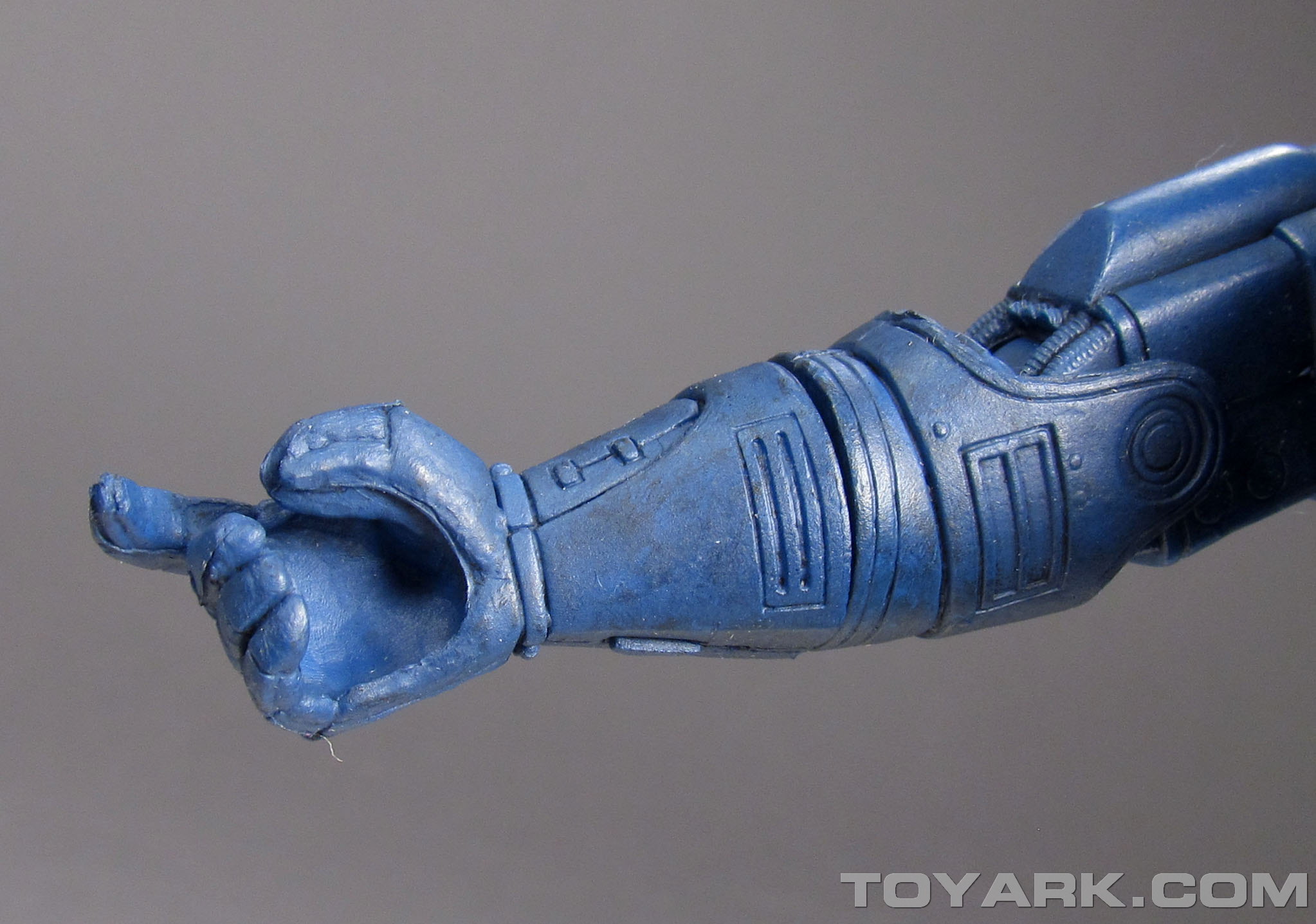
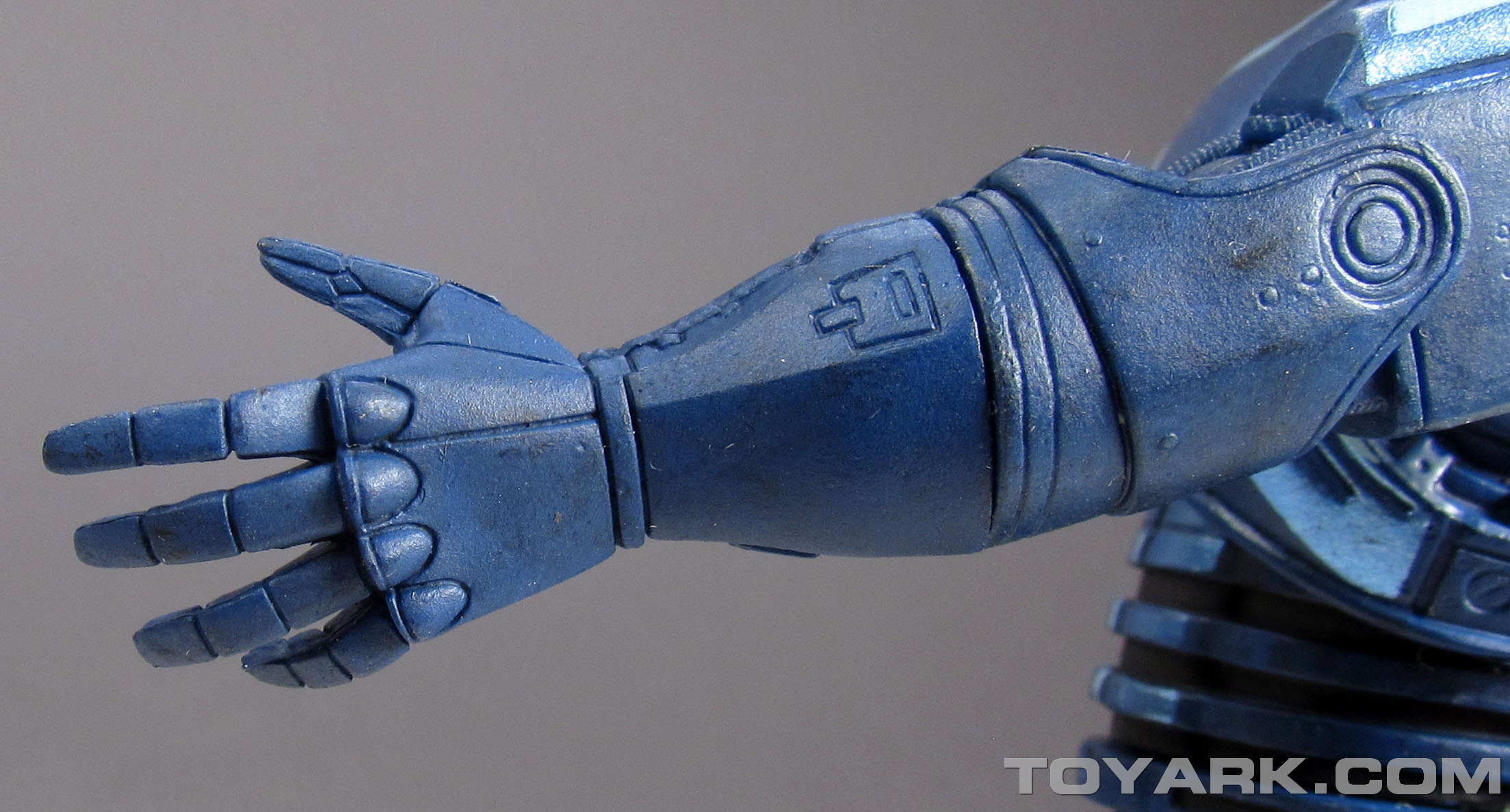
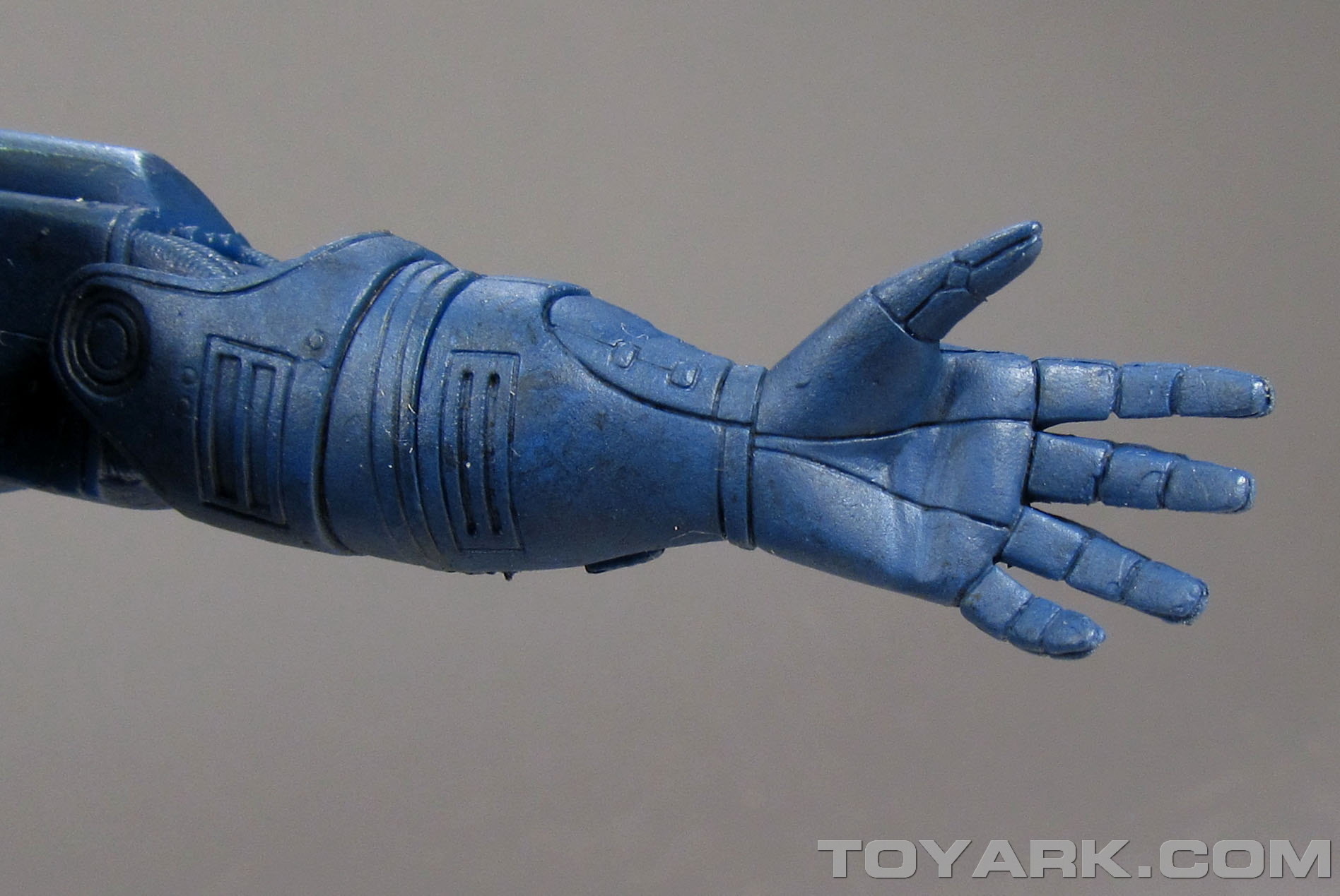
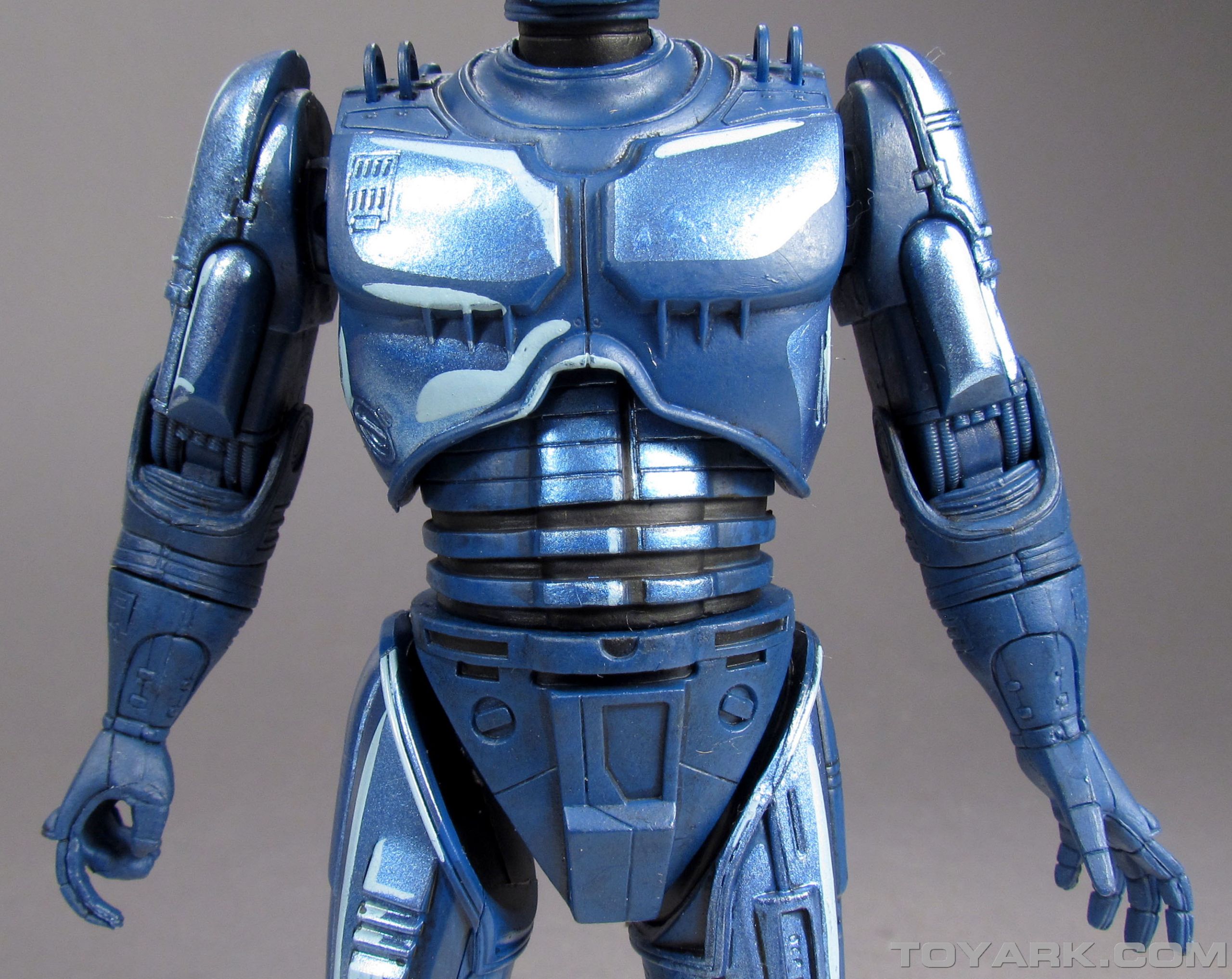
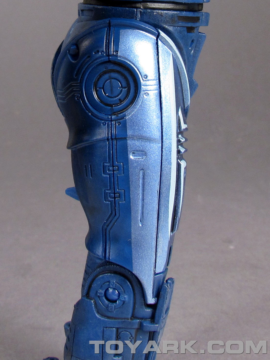
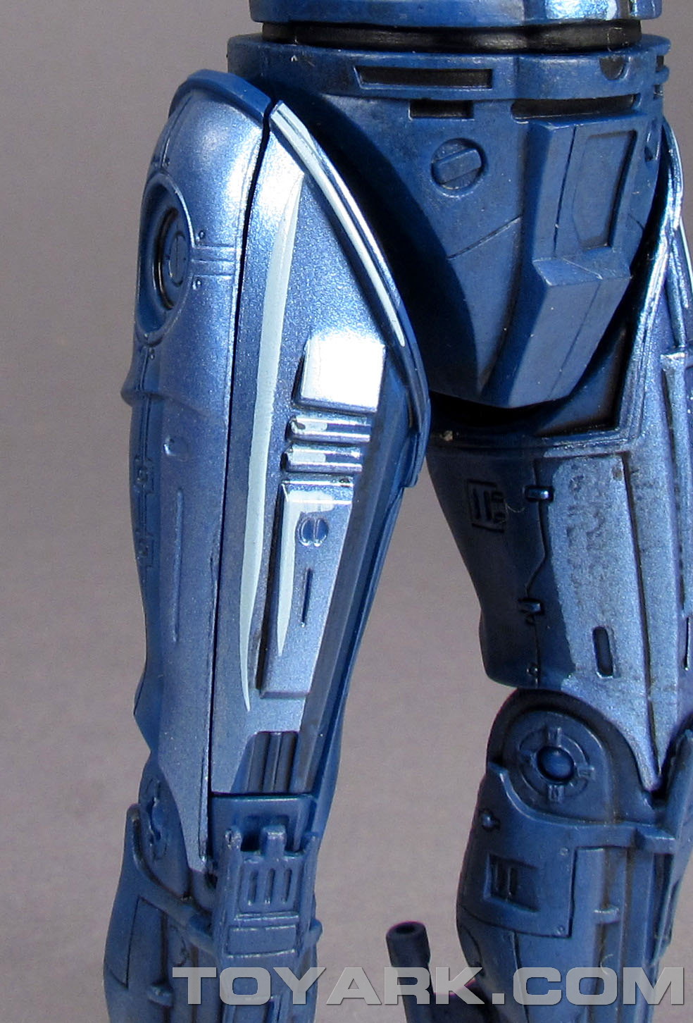
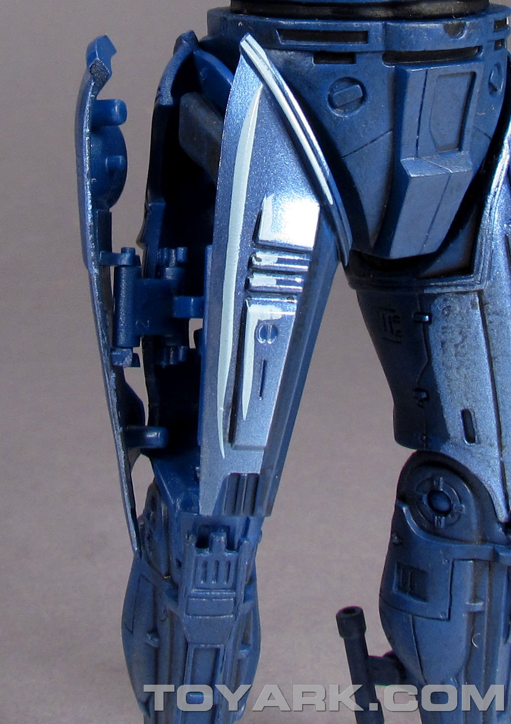
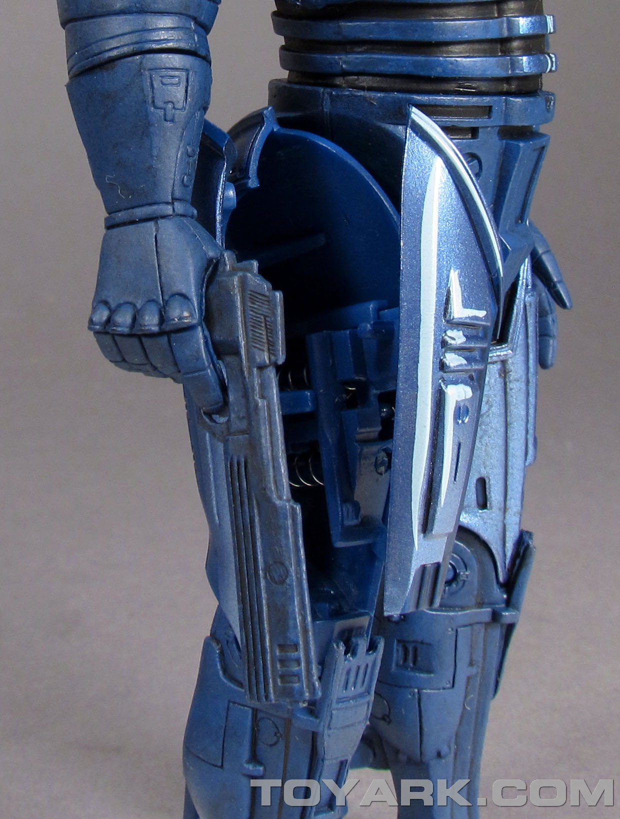
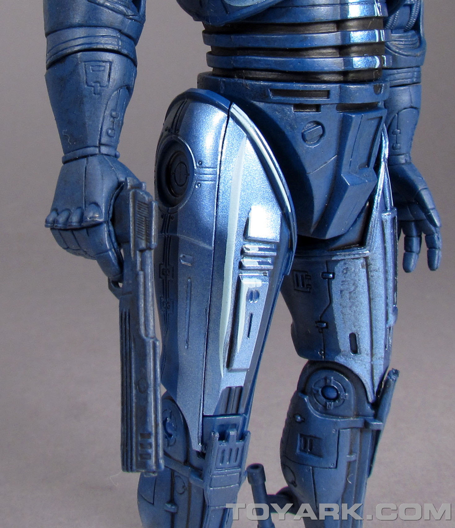
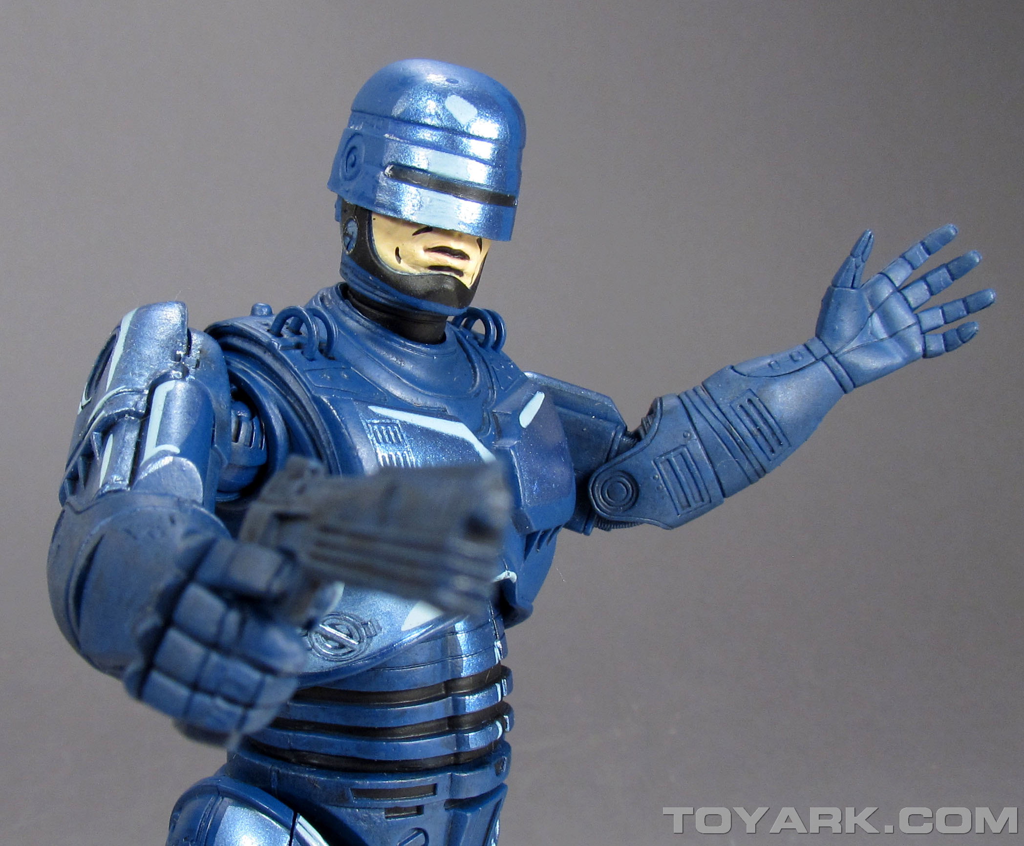
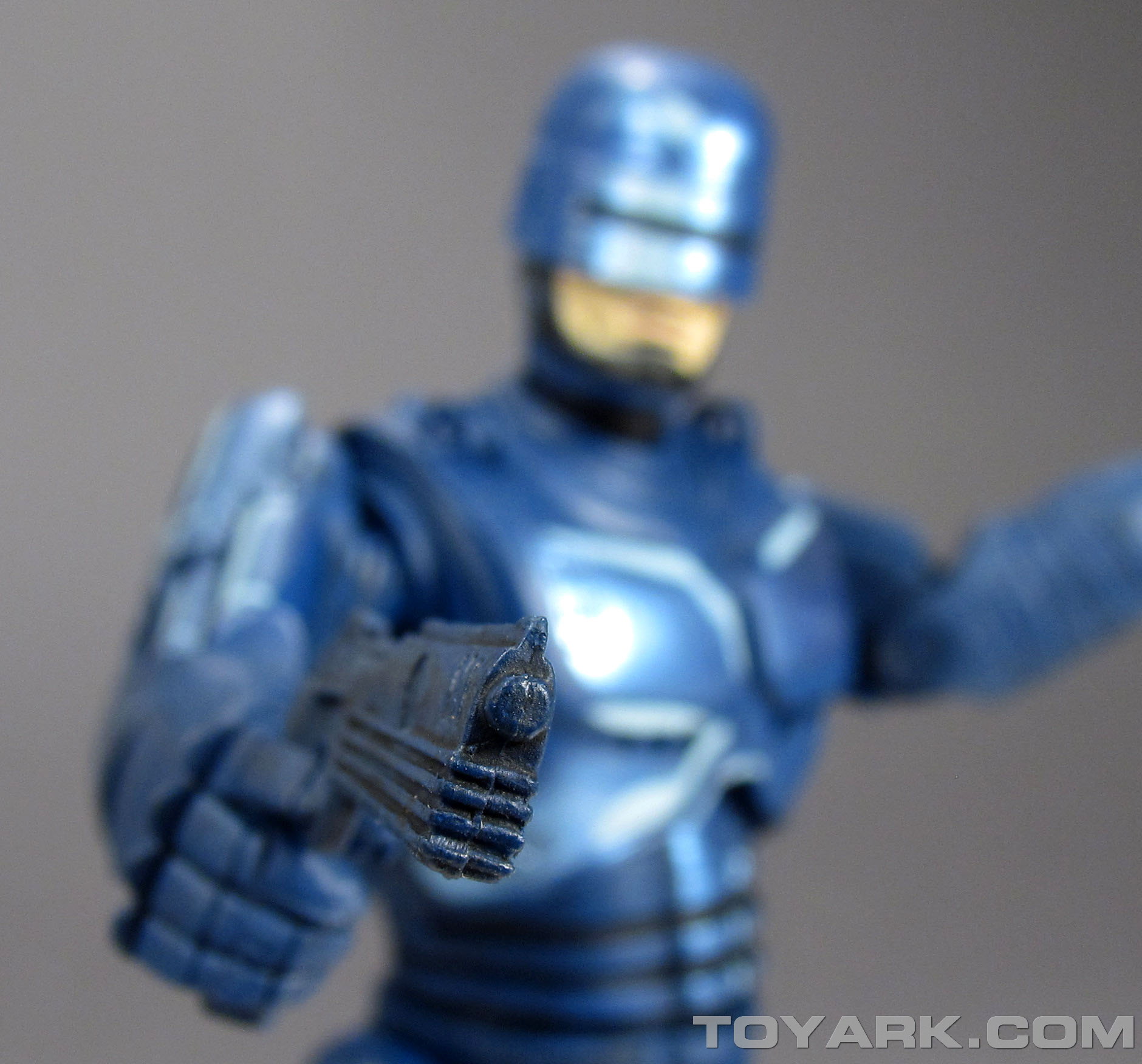
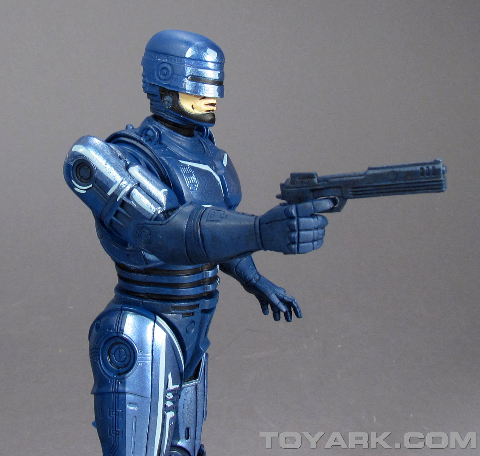
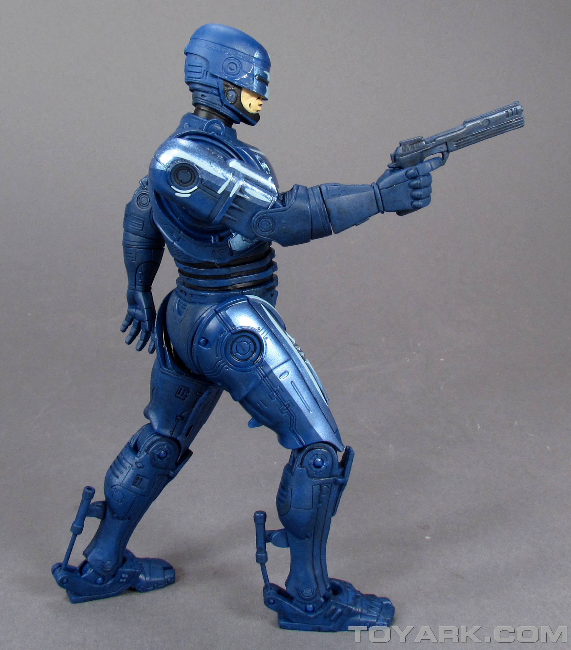
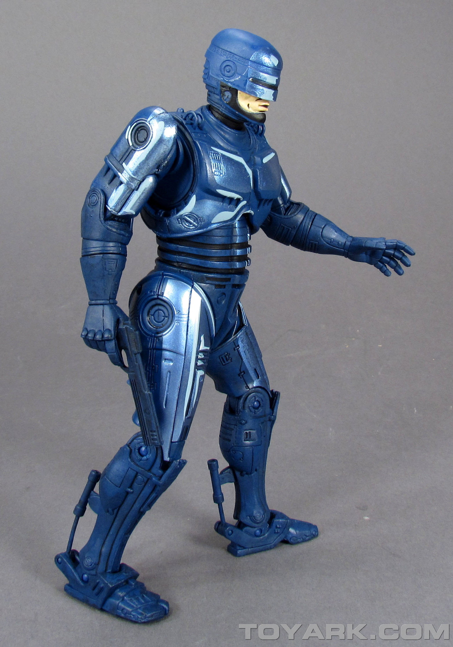
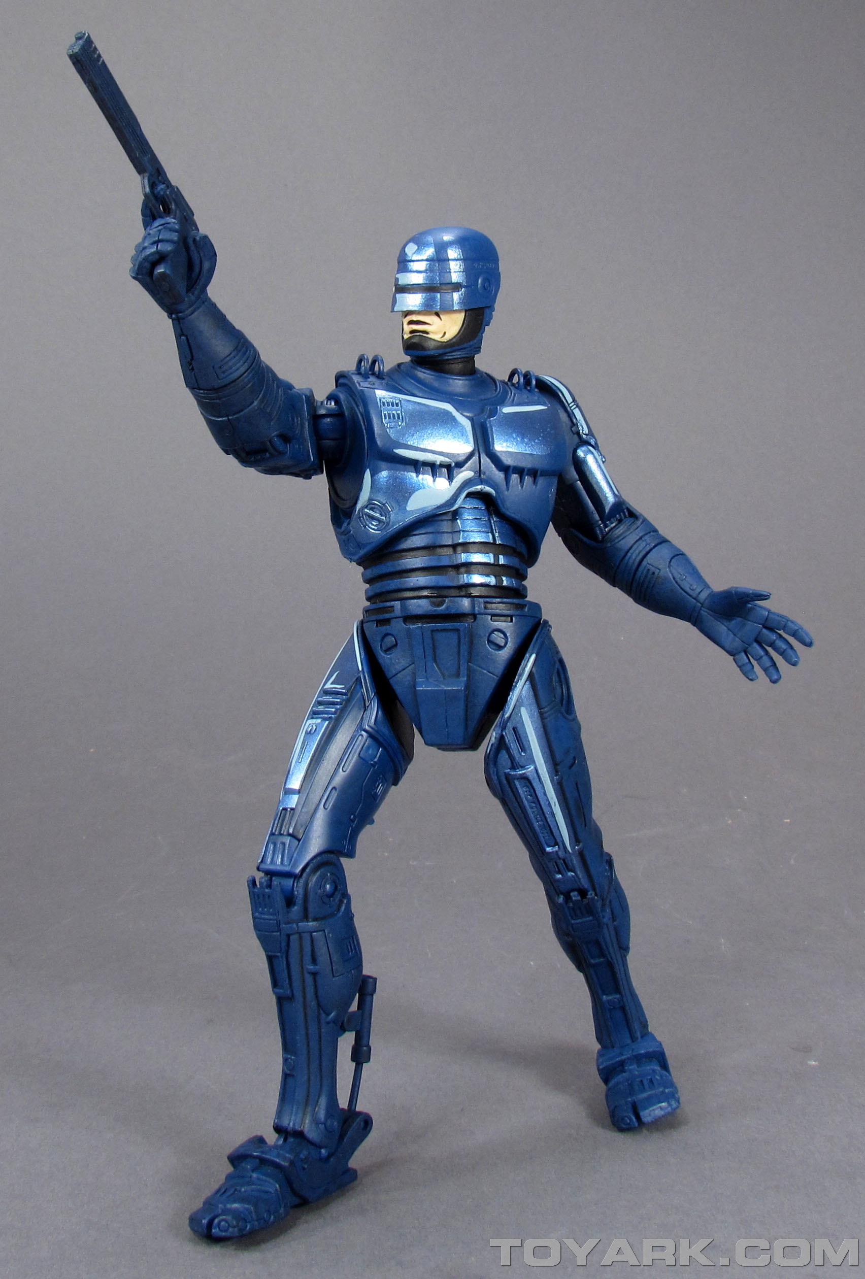
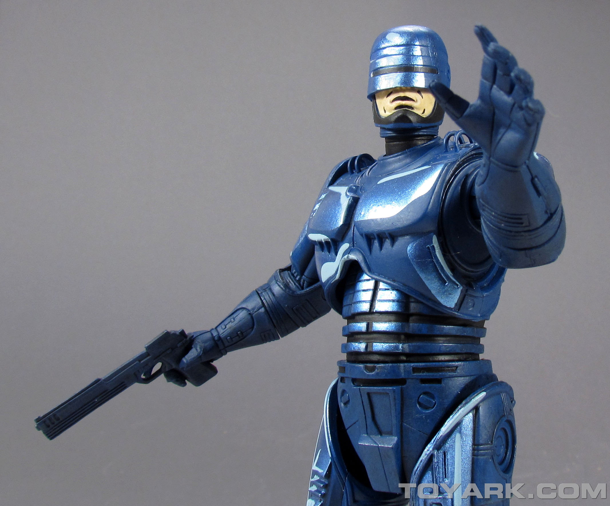
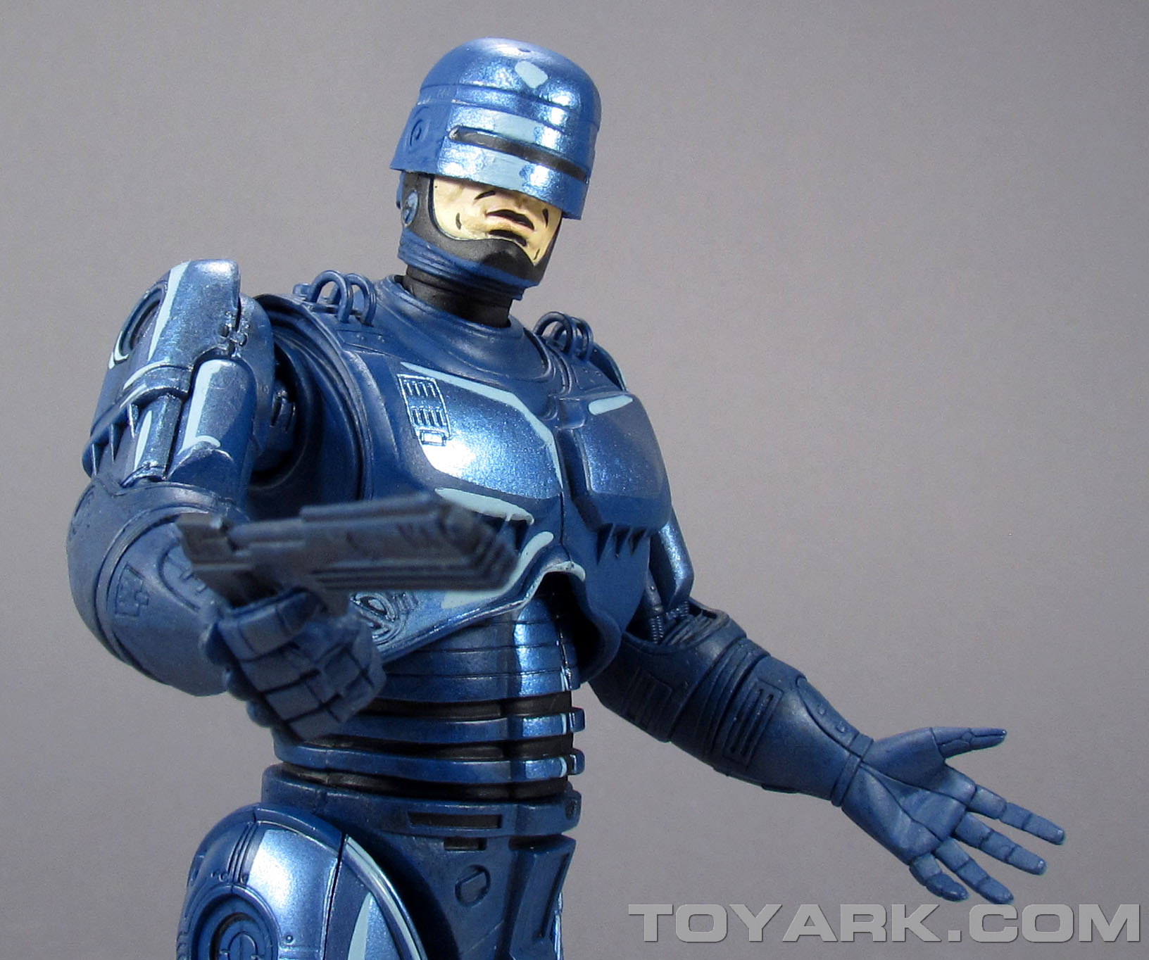
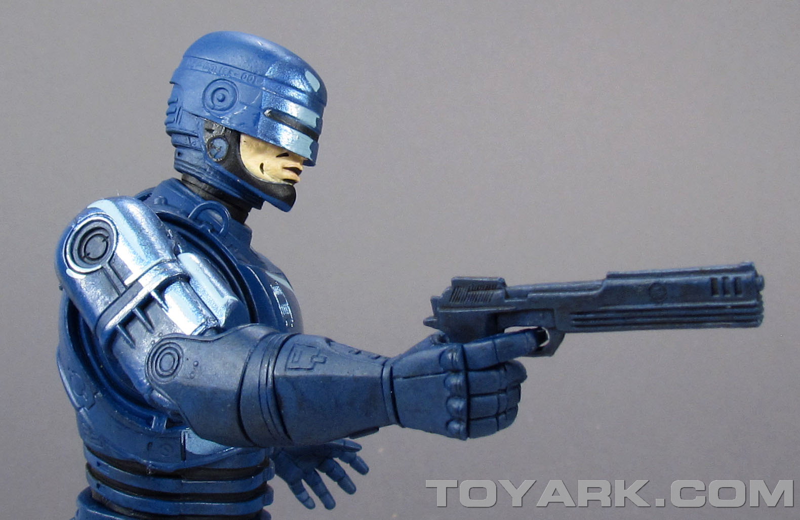
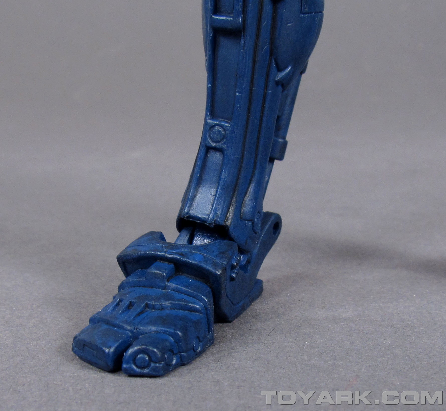
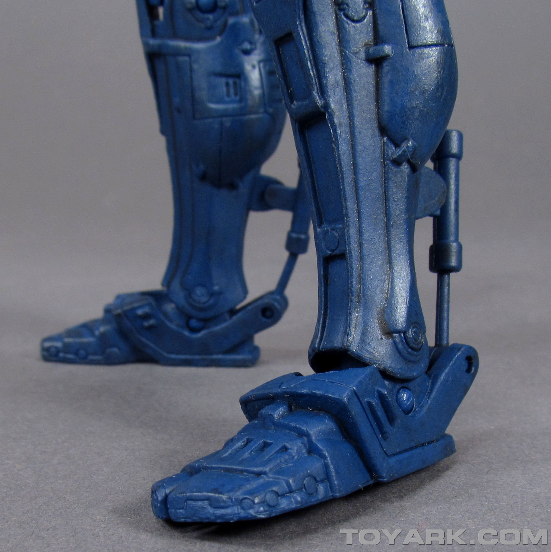
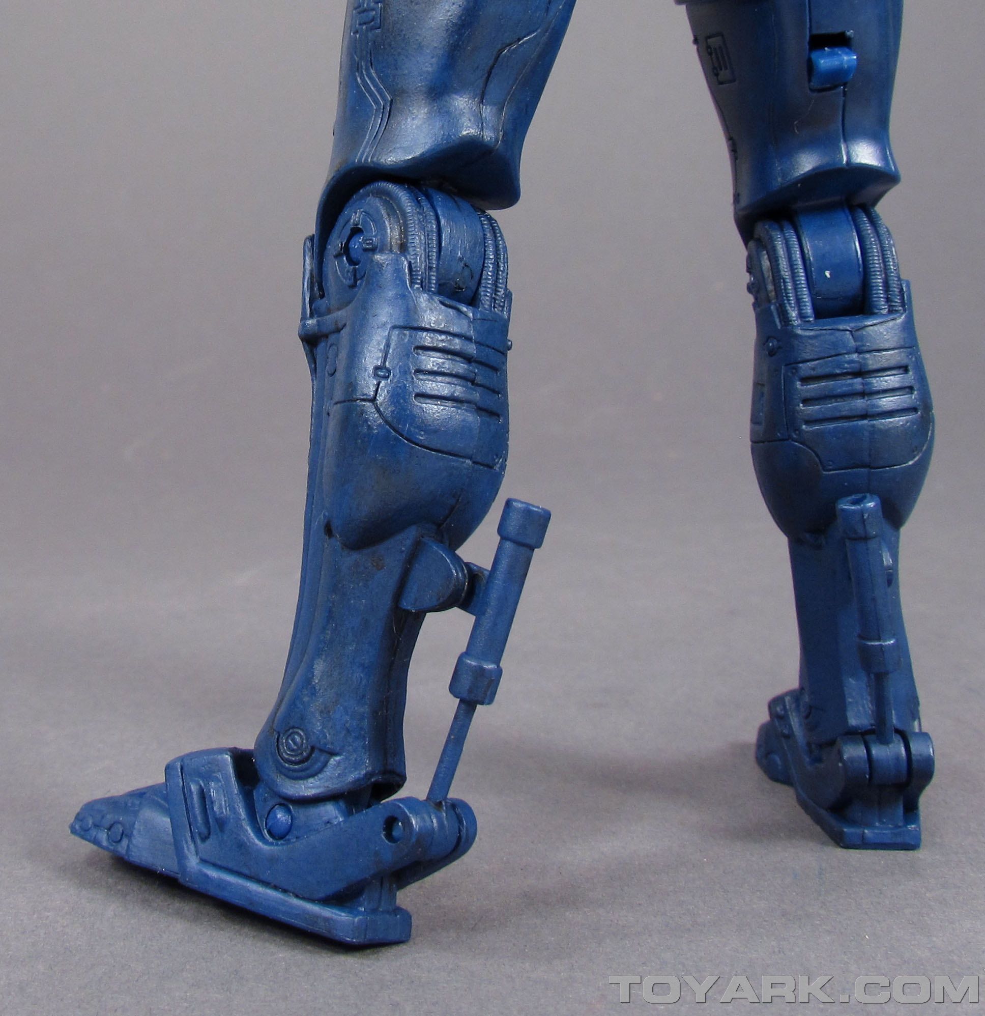
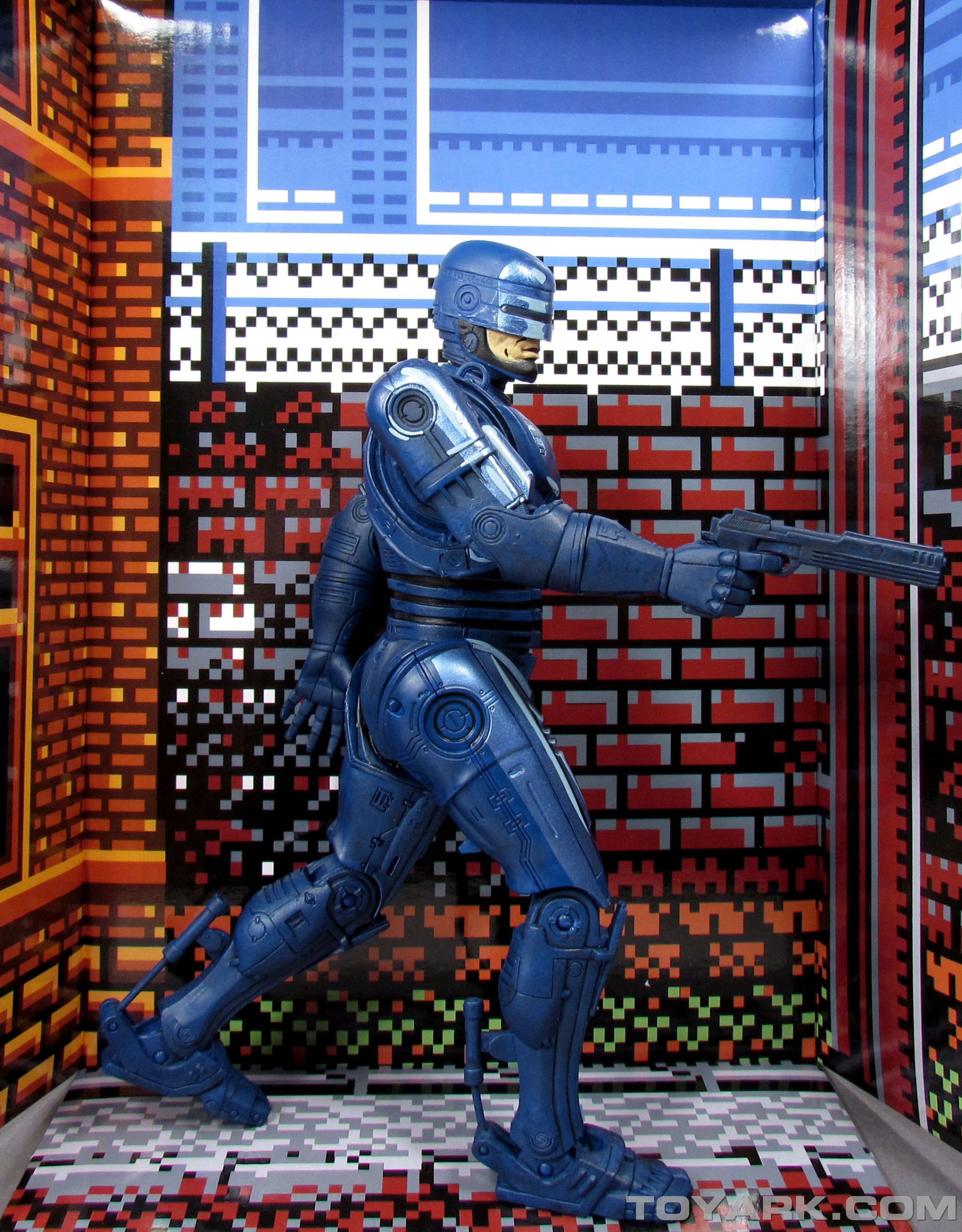
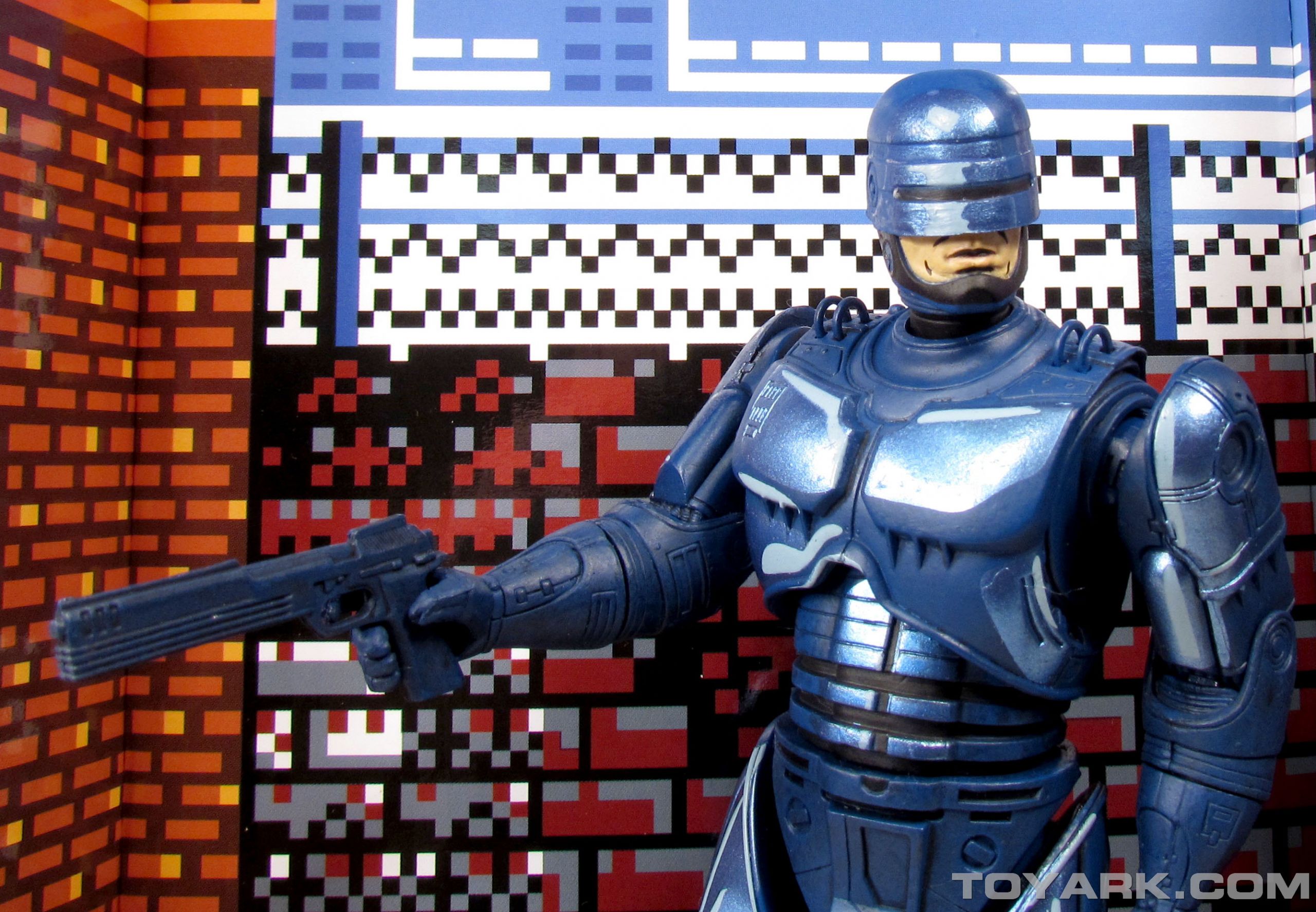
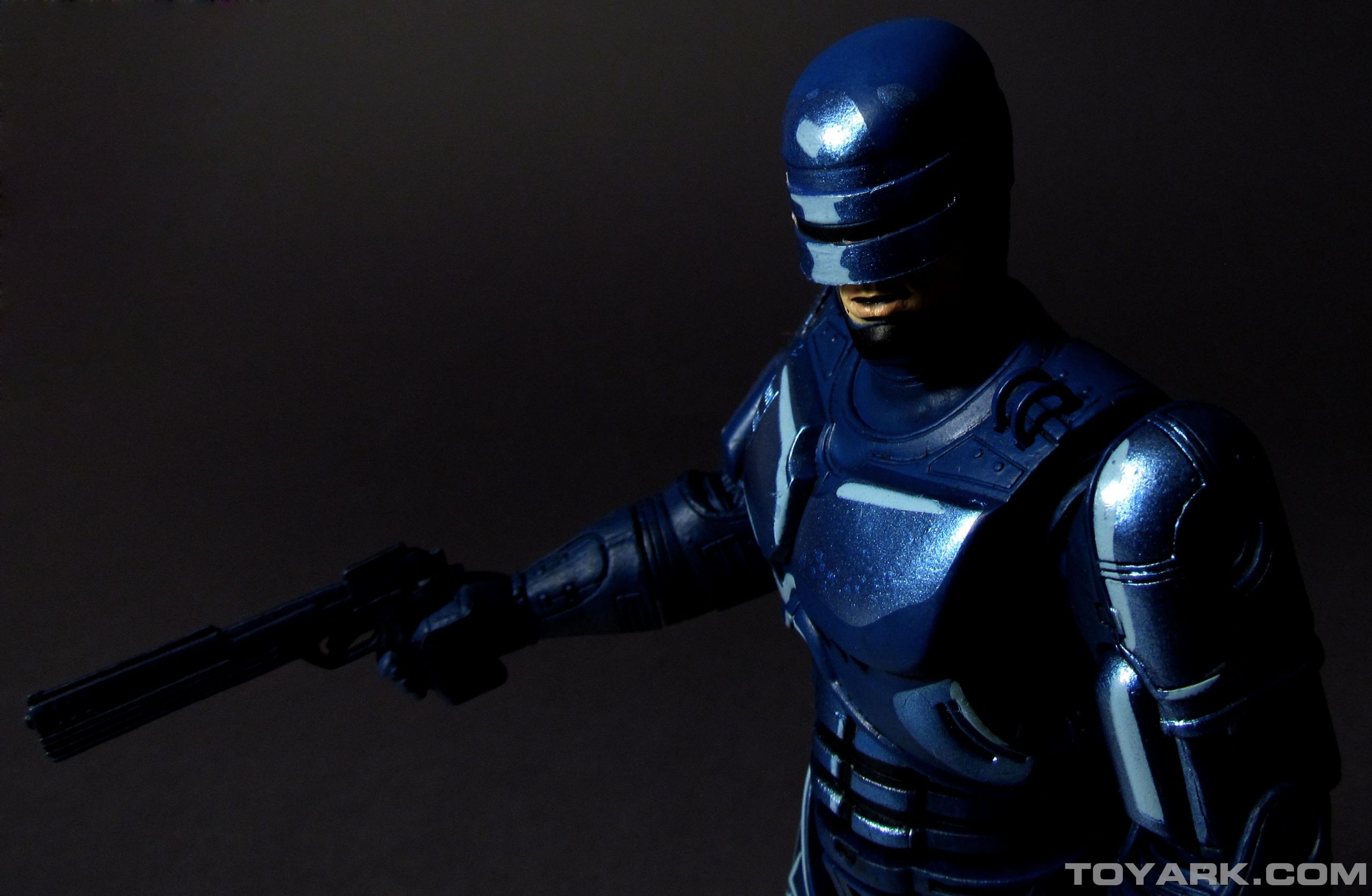
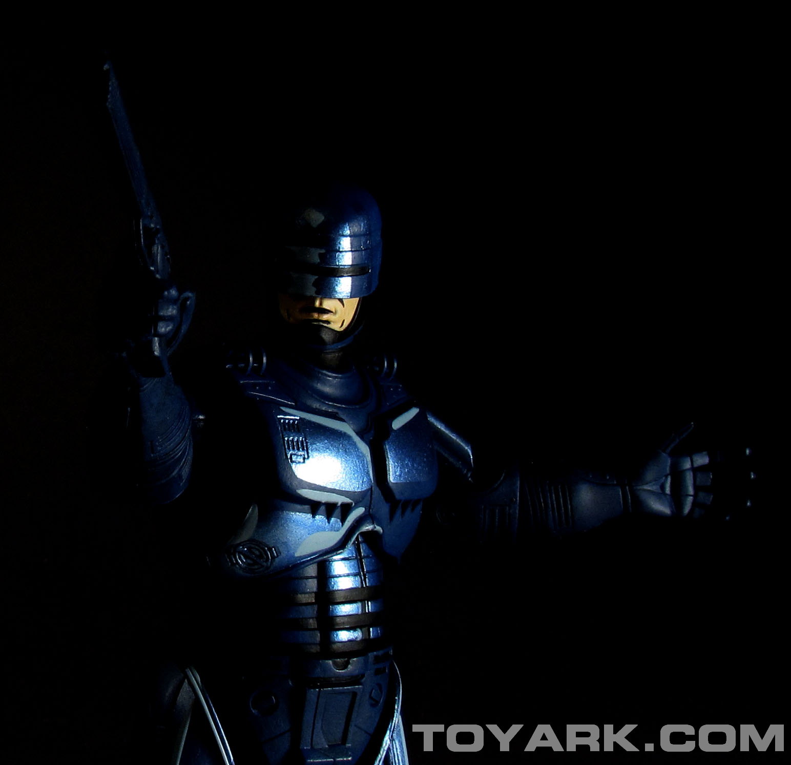
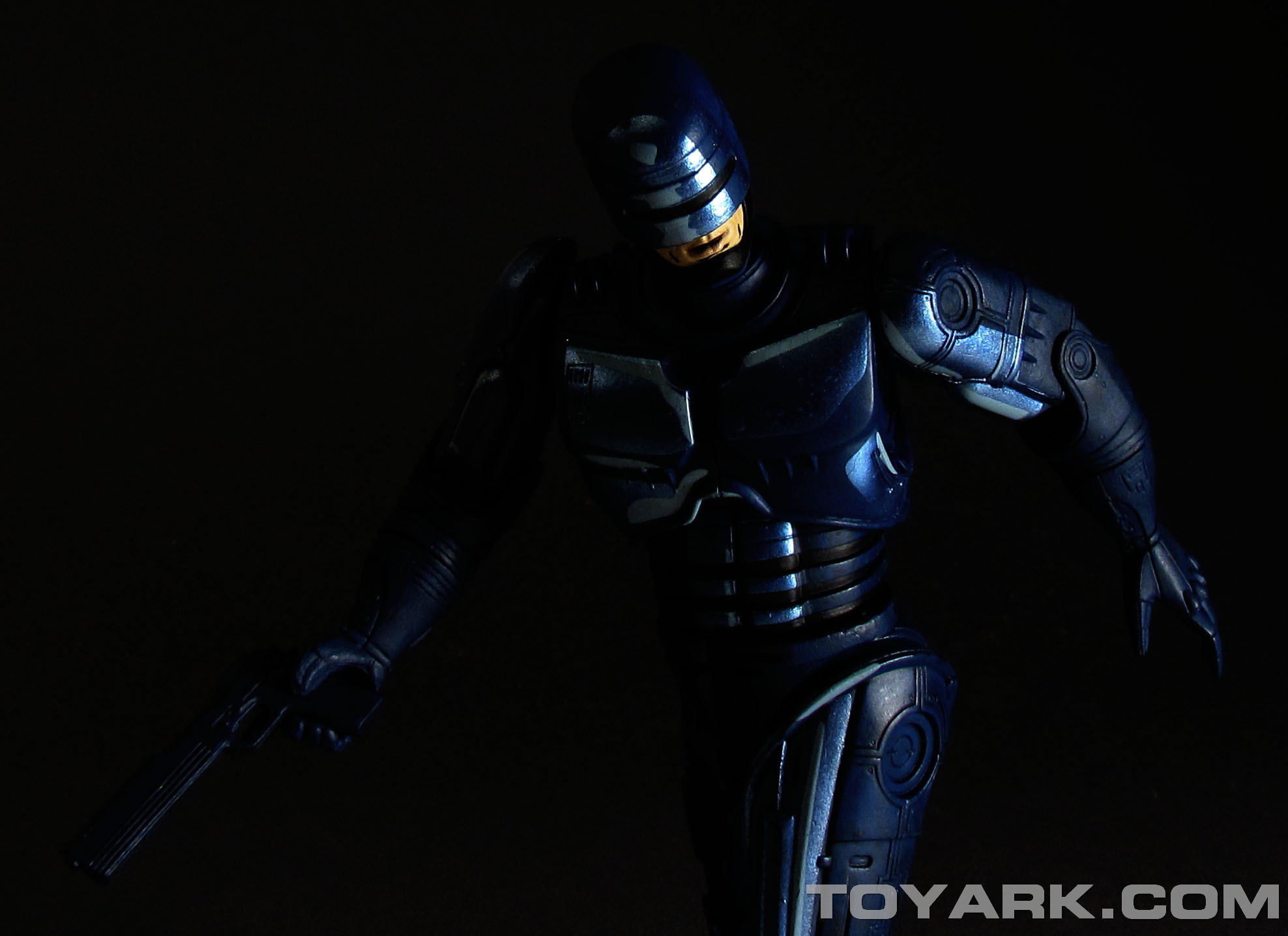
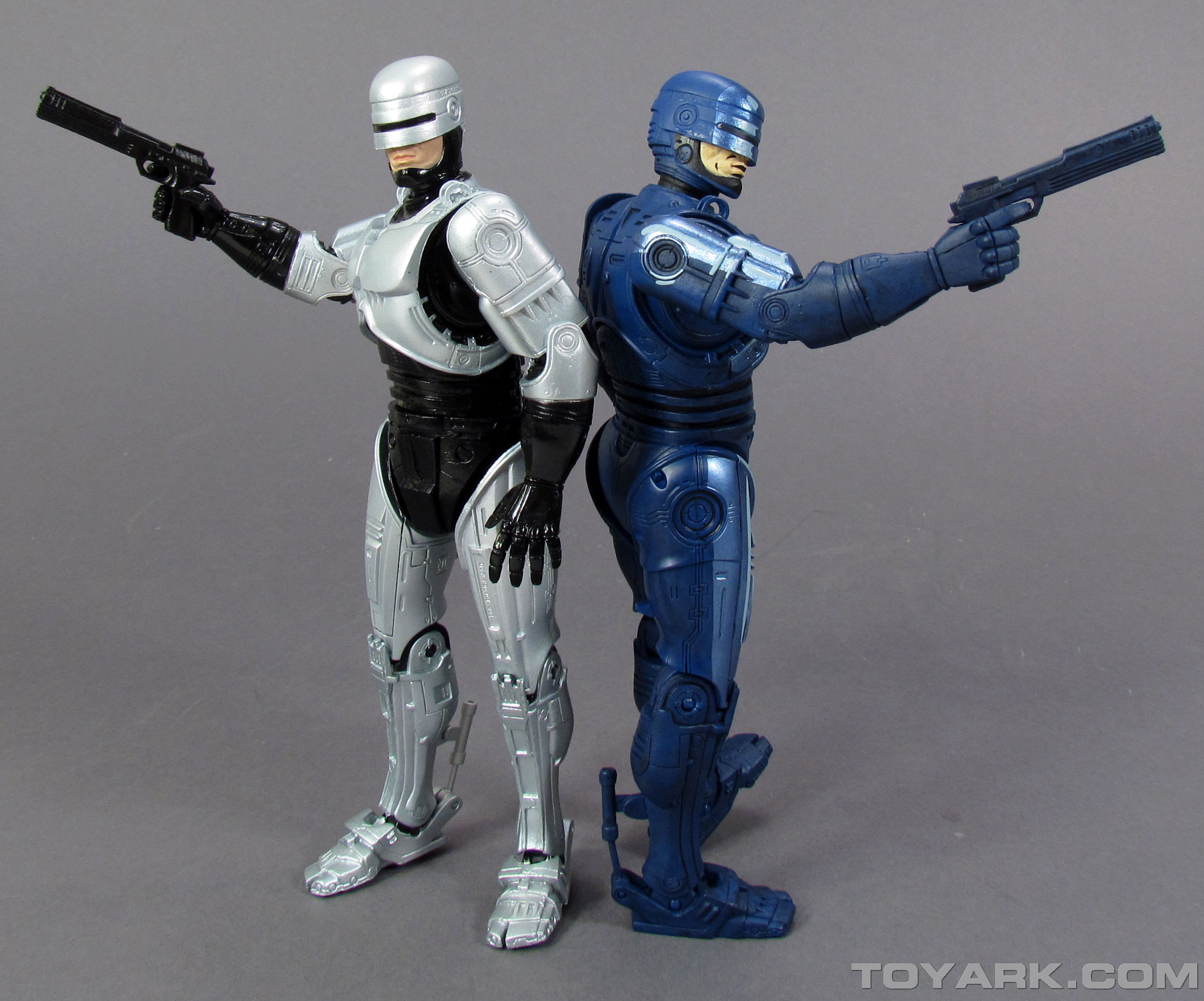
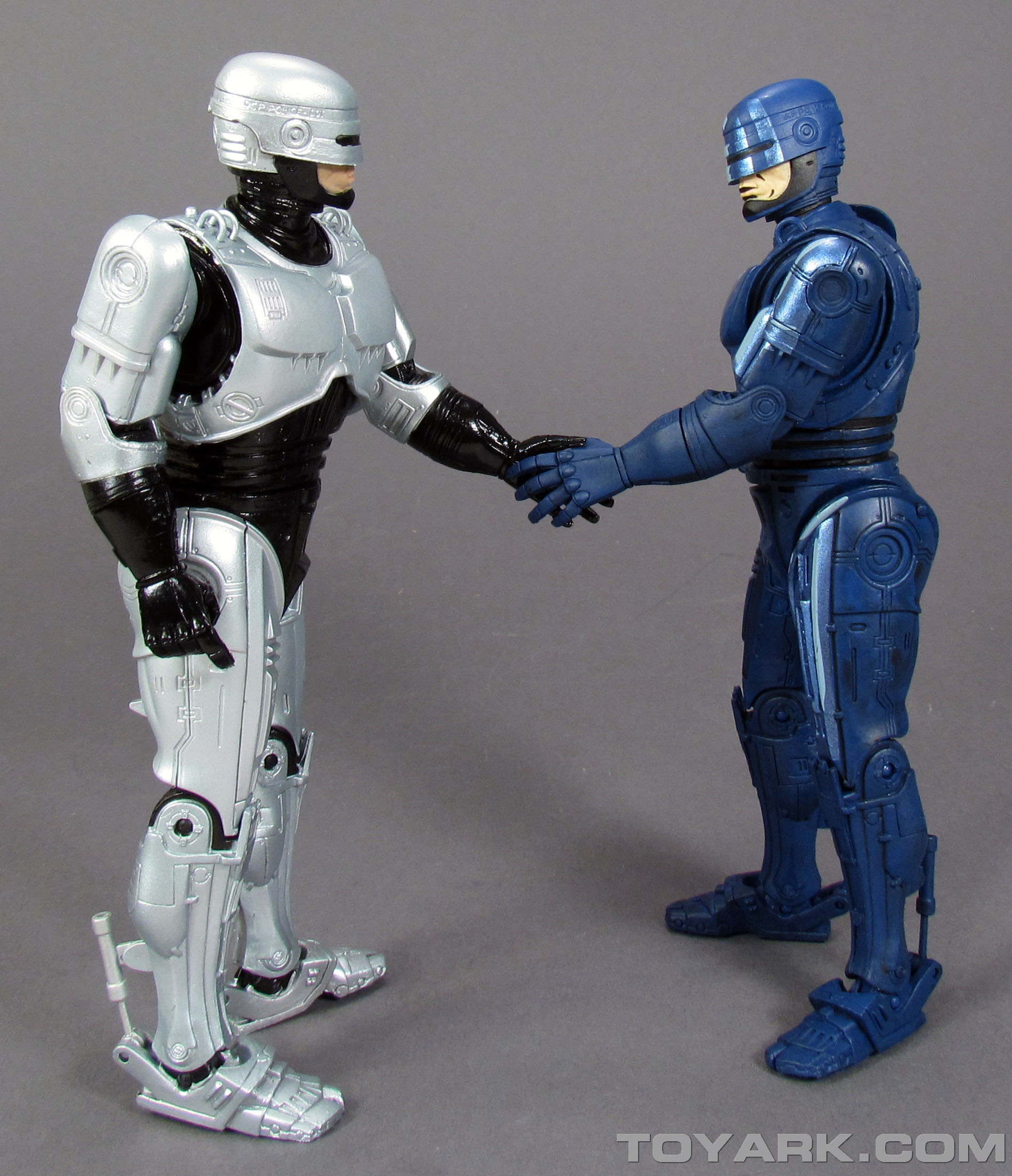
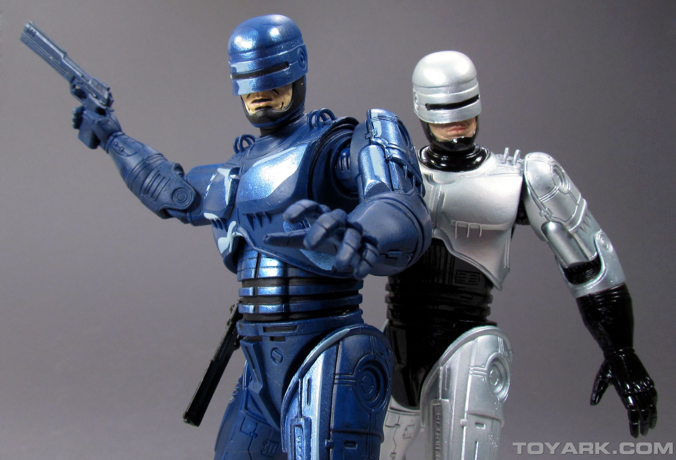
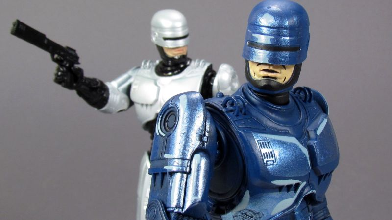
Once out of the packaging, Robocop features a very unique paint scheme. While the original NECA Robocop sculpt was very detailed, the paint adds their own lights and shadows. The previous releases of NES Freddy Krueger and NES Jason Voorhees featured mostly solid colors, with little to no added paint details. That was meant to convey the look of the in-game sprites. With Robocop, NECA attempted to replicate the look of the cut scenes from the NES game by adding dark and light blues over the already dark blue base color. There are also white highlights painted on. Some of the lighter blues feature a metallic sheen. The exposed skin of the chin has added black paint to mimic the dark lines of the game. The overall figure also features a very dark wash over to to bring out the sculpted details. The overall look is that of a hand painted figure. Paint is very thick, though doesn’t hinder movement of the joints. However, the thick paint does cause a bit of an issue. If you look at the pictures I took, the right jaw features a gouge or bit of melting. The right side of the visor also features a bit of paint peel. This is how it came out of the box. Those are two minor, but very noticeable blemishes on an otherwise beautiful paint scheme. It’s also disappointing to see the defect in such a visible area. This doesn’t appear to be that wide spread, so mine is likely an exception.
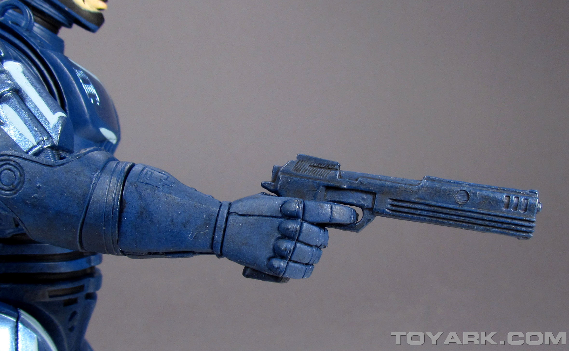
The mold is based on the spring loaded holster Robocop that NECA previously released. His gun comes already seated in the holster. The thick paint does not cause any issues with the spring mechanism. The figure articulates at the neck, shoulders, elbows, wrists, waist, hips, knees and ankles. The nature of the sculpt limits the articulation in some spots, like the elbows, but doesn’t prevent the figure from dynamic poses. Joints are tight without feeling brittle. In fact, the figure feels even more slid than the standard release. I’m guessing the combination of a different plastic and the paint used added just a tiny bit of extra weight to the figure, giving it a nice solid feel.
Overall, I am absolutely pleased with the figure. The paint scheme is beautiful, the sculpt detailed and the figure is solid. While the defects are a disappointment, there’s no evidence this is wide spread. Hands down this is the best release in NECA’s video game series.
See some photo highlights below and the full gallery after that.